

Indocrypto Website
Indocrypto is a cryptocurrency and blockchain technology information and research platform. Indocrypto provide market data information and the latest crypto news coverage through the Indocrypto.com website. Indocrypto produces and curates information served on the website. Also, provides various tools (web apps) to help users learn and research cryptocurrency.
This one is another project of my freelance jobs. So in this project my role as a UI Designer is designing the User Interface based on the current flow that has been created.
Task
Help to create the website design and design system component and token from current design.
Redesign the indocrypto website that provides users with accurate and up-to-date information about cryptocurrency, as well as tools and resources for them to learn more about cryptocurrency.
The target audience for this website is anyone who is interested in cryptocurrency, including investors, traders, and the general public. The website will be designed in a way that is easy to use and navigate, and it will be visually appealing.
The biggest challenge was to Design a website that is easy to use and navigate because it’s essential for user experience. This includes using clear and concise language, creating a logical layout, and providing helpful navigation. With an unfamiliarity with cryptocurrency, I need to dig deeper knowledge about cryptocurrency to make clear and easy-to-understand information content on the website. Also, make it more friendly to newcomers.
After doing market research and reading the news and article about cryptocurrency, I get a better knowledge of it. After a few hours surfing on Google, I can summarize that most Cryptocurrency websites can be complex, and they may require users to have a certain level of technical knowledge in order to use them. This can be a barrier to entry for some users, and it can also make it difficult to use these websites for everyday tasks. That’s becoming a pain point that most users faced (including me :P)
…
So what’s the Solution?
So here is the solution to the problem that I and most of the users faced :
- Use clear and concise language: Avoid using jargon and technical terms that users may not understand.
- Make the website easy to navigate: Use clear menus and labels, and make sure that the website is responsive on mobile devices.
- Provide clear instructions: Explain how to use the website’s features in a clear and concise way.
- Offer support: Provide a way for users to get help if they have problems using the website.
- Accessible Design: Ensure that the user interface follows accessibility guidelines to accommodate users with disabilities, such as providing alt-text for images, dark-mode color contrast, and maintaining proper color contrast.
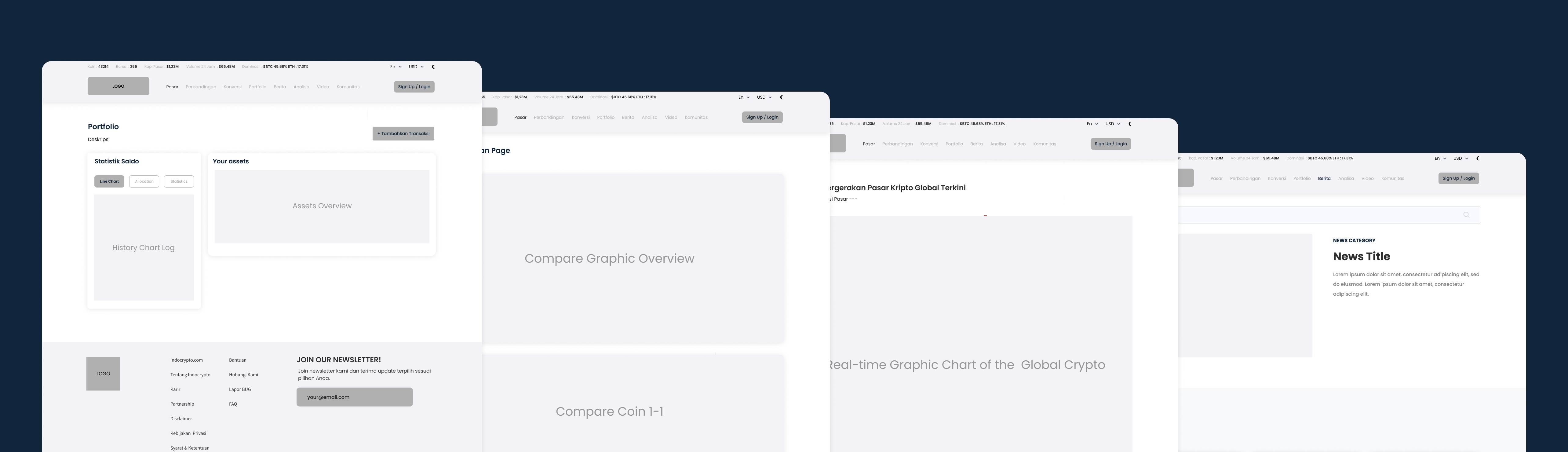
In the first step, wireframes were created to test and agree on general directions and clarify content blocks and fix the structure of the website. To align the vision between me and the stakeholders.
| Primary #1389F7 |
SCSS var $color-blue |
◯ |
| R 19 G 137 B 247 |
Blue Ocean
| Beige #58BD8B |
SCSS var $color-green |
◯ |
| R 88 G 189 B 139 |
Green Leaf
| Grey #F2F2F7 |
SCSS var $color-grey |
◯ |
| R 242 G 242 B 247 |
Neutral Grey
| Black #11263C |
SCSS var $color-black |
◯ |
| R 17 G 38 B 60 |
Dawn Black
We provide dark-mode features that allow users to switch between the dark and the light contrast on the website. So the color selection for each primary pallet is important, the Blue Ocean color for light mode and the Green Leaf for dark mode.
Typeface
Poppins
Usage
All Family
I select Poppins as the Main font-family that we used in this project. I LOVE POPPINS!
The quick brown fox jumps over the lazy dog
I didn’t have much time to do Usability Testing for a real user since I only had a 5 days to submit the design. So here it is the result of my journey to designing the Indocrypto website. You can see the last version updated prototype below, cheers!
Homepages
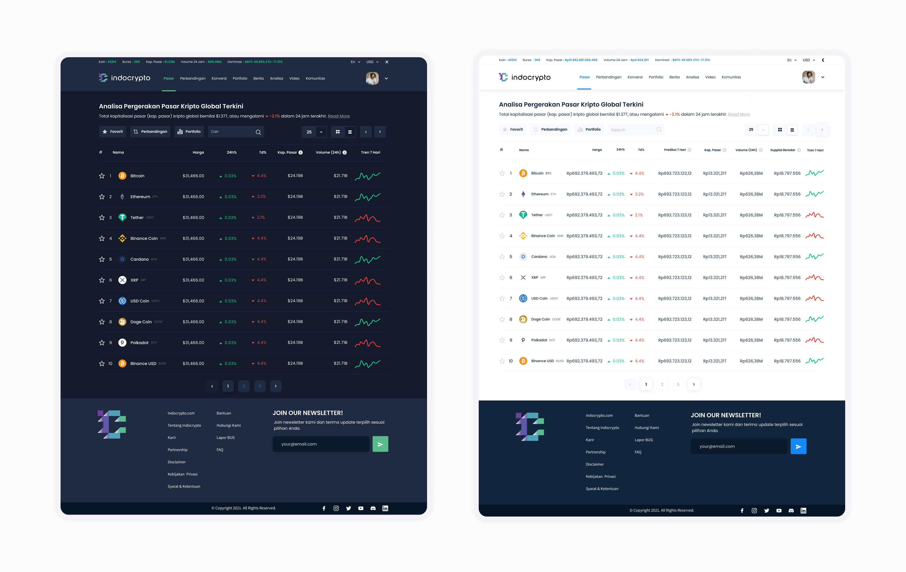
On the homepages, based on the market research, the graphic chart is using an API that is provided by a third-party application. So it’s basically using the default chart that is provided. On the navigation, I try to create a menu that the user has a high familiarity with it. Make it more user-friendly and easy to navigate. According to Jakob’s Law. Below the page title, I try to add a simple word to describe and summarize the movement of the chart.
Compare Pages
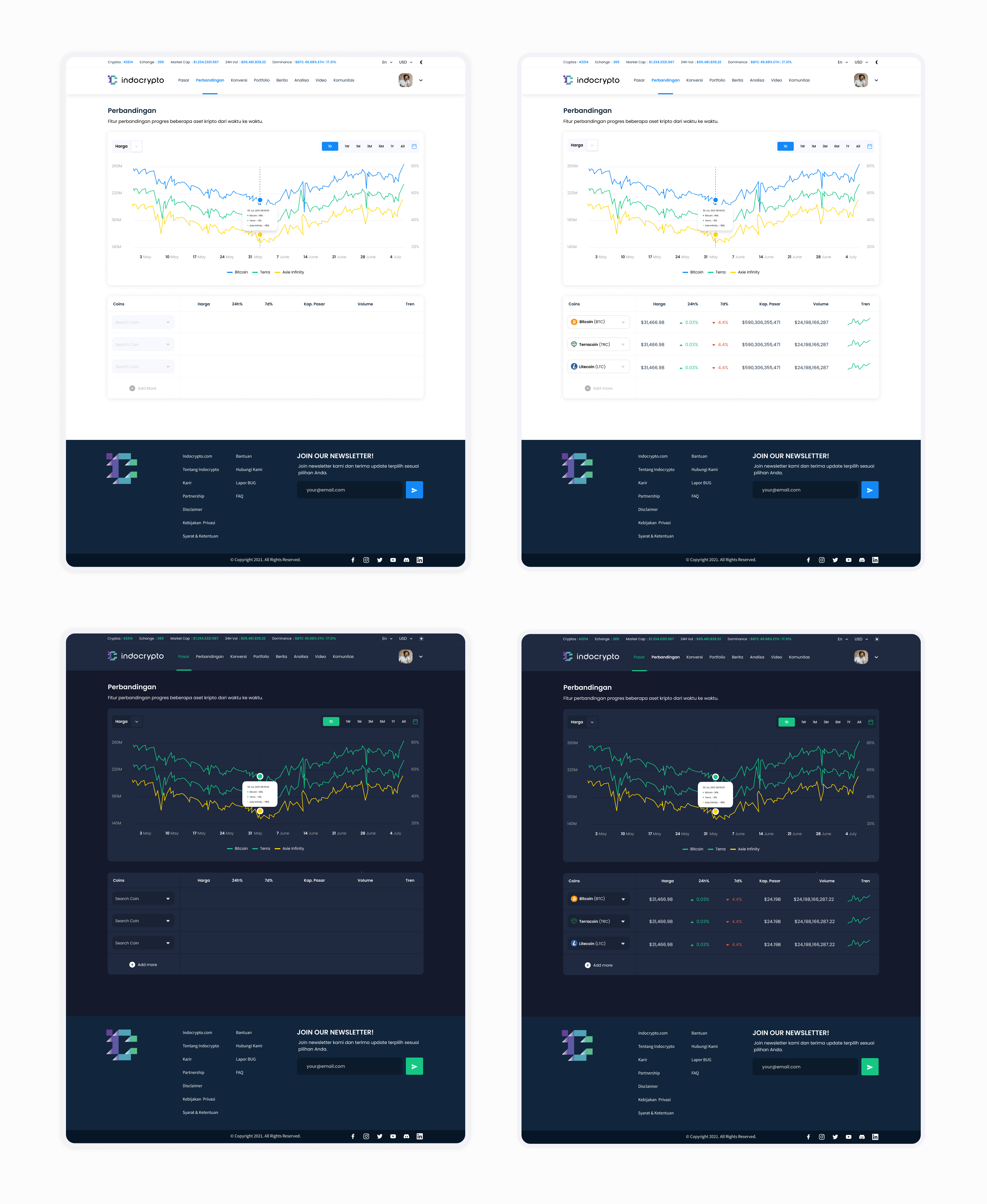
On the compare pages, users can compare between 2 and 10 coins, making user easier and faster to take decisions. Also, the user can see the chart based on the chart movement of each coin.
Coin Pages
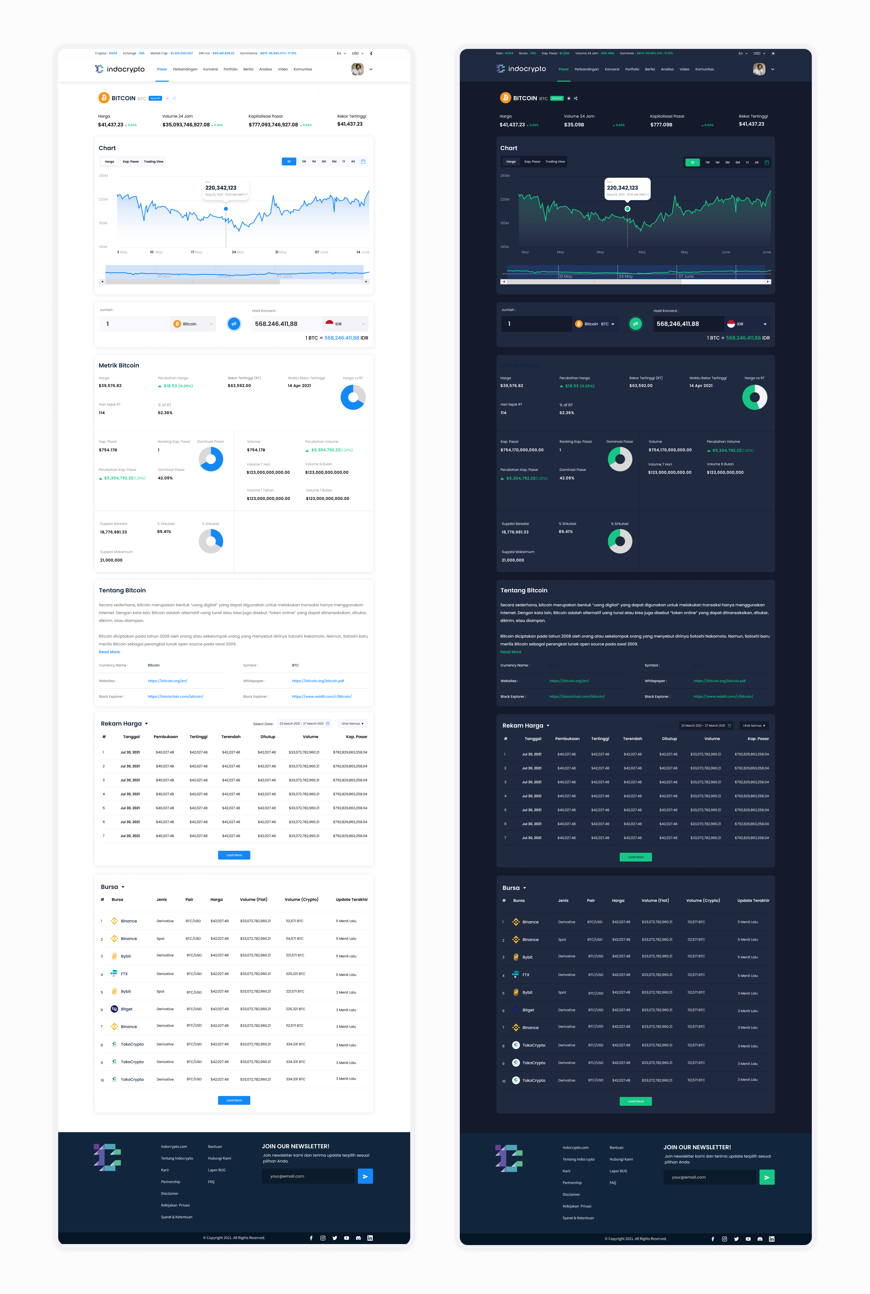
As in e-commerce apps, you can see the product details page, I used the same concept as it is, but in a coin way. Giving the user information for each coin from Coin price, 24h Volume, Market Caps, Highest Price Record, and Bitcoin Matrix. Here is the UI :
News Pages
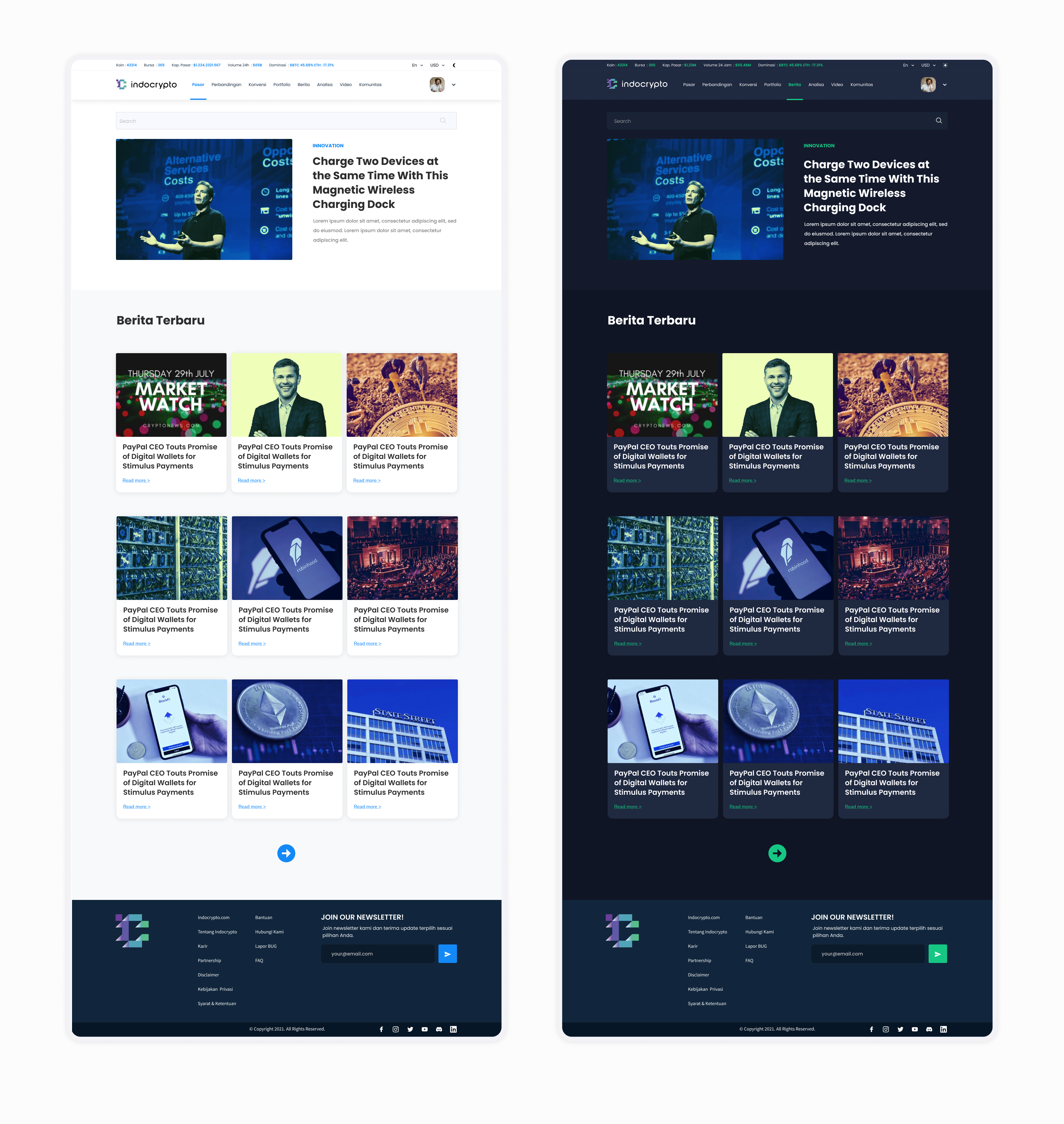
It is usually just the same as another news page on a similar website, I try to create news that is easy to read and easy to access. User familiarity with other website is a beneficial point that I can use.
Product features & Design:
-
Currently, the Konversi page is direct to the web app, on the next step we need to create the Konversi page on the same site.
-
Create consultation features to monetize and start creating income.
-
Create a page Komunitas to cater for the forum on the website
-
Enhancing the search features