

Female Daily Marketplace Case Study
In the bustling world of beauty, there exists a captivating marketplace known as Female Daily Studio. This innovative platform serves as a haven for beauty enthusiasts, professionals, and brands alike, offering a unique and transformative experience that transcends the traditional beauty landscape.
Task
Designing an marketplace app that connecting the beauty lover and seller.
This case is the most challenging and fun that I have been faced. A long journey to create a Big Online Beauty Marketplace.
I will tell you about Female Daily, Female Daily is a prominent beauty and lifestyle platform that originated in Indonesia. It serves as a comprehensive resource for beauty enthusiasts, offering a wide range of content, product reviews, discussions, and community engagement.
At its core, Female Daily aims to empower individuals to embrace and celebrate their unique beauty. The platform provides a wealth of information and insights on skincare, makeup, hair care, fragrance, and overall well-being. It covers topics such as product recommendations, beauty tips, tutorials, trends, and industry news.
One of the standout features of Female Daily is its extensive database of product reviews. Users can find detailed and honest reviews from a diverse community of beauty enthusiasts, helping them make informed decisions before purchasing beauty products. Additionally, the platform encourages open discussions and allows users to share their personal experiences, recommendations, and insights.
So what does Female Daily need? You’re right! A platform that connects all beauty reviews with Online Marketplace. So we need a platform that gives honest reviews and a platform that provides online shopping. So we can make the user-buying process seamless.
At this time, my challenge is to create a brand new platform marketplace called Female Daily Store, where a stand-alone seller can sell their product (Not just Female Daily)on this platform. Also, I will tell the story how my approach to every feature that we create in this project. From Seller Center for Seller, Admin Panel for Admin, and Customer Facing for Customer. Well, it is a long long journey, prepare your pop-corn 🙂
For this case study, I have chosen to utilize the Design Thinking process. This approach was selected as it is an effective methodology and mindset when tackling complicated issues, especially those that are centered around human needs. By using Design Thinking, I aim to find the best solution to this challenge in a user-centered manner.

There are 5 Stages in the Design Thinking Process:
Empathize →Define → Ideate →Prototype → Test
I will explain each and every phase in detail and try to elaborate on research I have done to improve the experience of Female Daily Marketplace.
I have done User research in this phase to understand what are the pain points that users are already facing in other apps and to understand what they are expecting in the Female Daily Studio Marketplace apps. But, let me make it clear, at this time I will tell you only the customer journey, not from the Seller’s or Admin’s point of view. In the next case study, I will tell you when I’m designing the dashboard for Admin and Seller.
So, let’s continue,
I have done research in two ways:
A. User Research
B. Market Research
There are two types of User Research methodologies, those are Qualitative and Quantitative Research. I have chosen Qualitative Research because I had a time constraint.
These are the Questions I asked in the User interviews:
- Tell me about yourself.
- How often did you buy a beauty product from online e-commerce apps in a month?
- How do you typically discover new beauty products or brands online?
- When browsing beauty e-commerce websites or apps, what information or details do you find most useful and informative about the product?
- What role do customer reviews and ratings play in your decision-making process when buying beauty products online
These are the basic questions I started the interview with, and every question has many follow-up questions based on their answers.
Persona 1
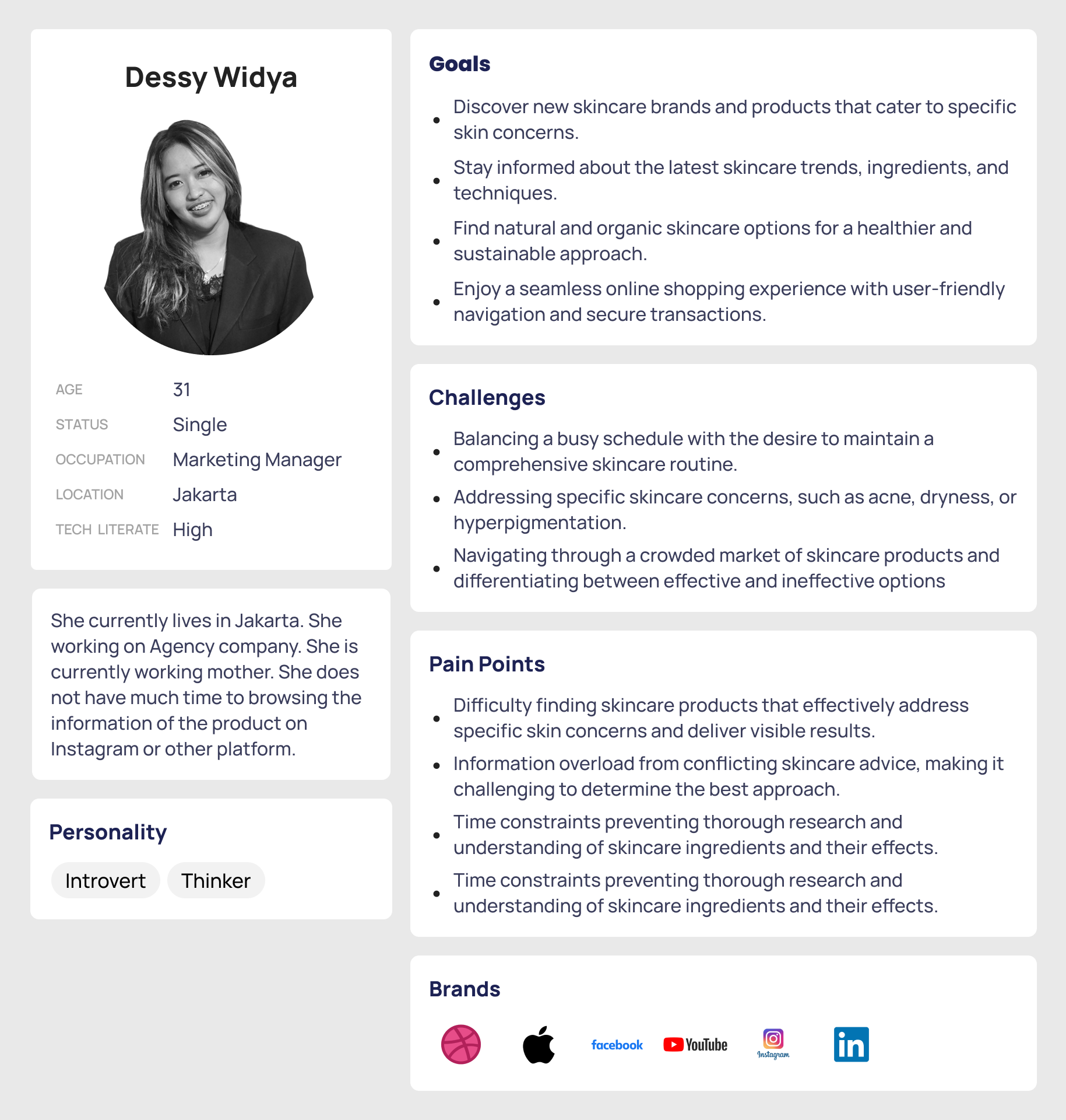
Persona 2
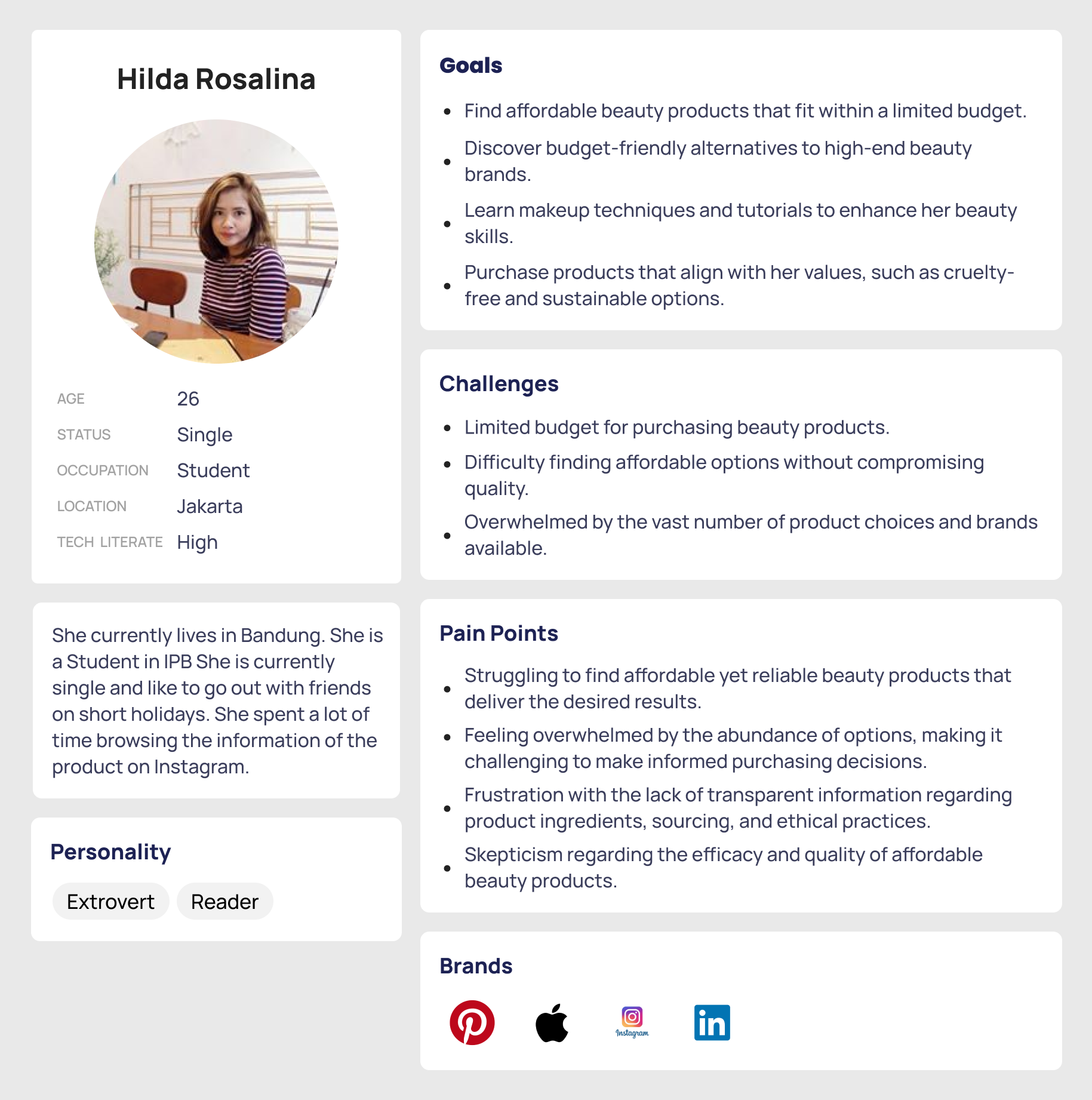
I get an few Key insight from User Interview phase :
- Importance of Detailed Product Information: Users place significant importance on having access to comprehensive and accurate product information, including ingredient lists, usage instructions, and potential allergens. Lack of detailed information can lead to hesitation or uncertainty about making a purchase.
- Authenticity and Trustworthiness: Users value authenticity and trustworthiness in online beauty retailers. They appreciate transparency regarding product sourcing, manufacturing practices, and certifications to ensure the products they purchase are genuine and of high quality.
- Personalized Recommendations: Users express interest in receiving personalized product recommendations based on their specific skin type, concerns, and preferences. They appreciate platforms that offer tailored suggestions and customized product bundles.
- Customer Reviews and Ratings: Customers heavily rely on customer reviews and ratings to make informed decisions when purchasing beauty products online. They trust the experiences and opinions of other users and appreciate platforms that provide a robust review system.
- User-Friendly Interface and Navigation: Users prefer beauty e-commerce platforms with intuitive and user-friendly interfaces. They appreciate easy navigation, clear categorization of products, and efficient search functionalities to find products quickly and efficiently.
- Seamless Checkout and Payment Process: Users value a seamless checkout process that offers multiple secure payment options and minimizes any potential friction or technical difficulties during the purchase journey.
- Access to Promotions and Discounts: Users express interest in accessing promotions, discounts, and loyalty programs that provide them with cost savings and incentives to purchase products.
- Responsive Customer Service: Users appreciate responsive and helpful customer service when they encounter issues or have questions regarding products, orders, or refunds. Timely and effective communication plays a significant role in their overall satisfaction.
- Skincare Education and Resources: Users express a desire for educational resources and content related to skincare tips, routines, and ingredient knowledge. They appreciate platforms that provide valuable information and insights to enhance their skincare journey.
- Ethical and Sustainable Practices: Users show a growing concern for ethical and sustainable beauty practices. They appreciate platforms that prioritize cruelty-free, eco-friendly, and sustainable product offerings.
I have done desk research which gave me many insights from a different point of view. I have seen a lot of statistics regarding the Beauty online Ecommerce / Marketplace in the Market. So that I can get involved completely and understand the problems from the majority point of view. And with Market Research I can get a clear understanding of what features the other apps had works and what’s not. If it works we can do it the same way, and if it doesn’t, let’s find the solutions.
Jakob’s Law
“User’s spend most of their time on other sites / apps, This means they prefer your site / apps to work the same way as all the other site that they already know.”
- Growing Beauty E-commerce Market: The market research may reveal a significant growth trend in the online beauty e-commerce market in Indonesia. This can be driven by factors such as increasing internet penetration, smartphone usage, and changing consumer preferences towards online shopping. https://ecommercedb.com/markets/id/beauty-care
- Preference for Local Beauty Brands: Indonesian consumers tend to show a preference for local beauty brands, which may have a strong presence in the online beauty e-commerce market. Market research can provide insights into popular local brands, their market share, and consumer sentiment towards them.
- Rising Demand for Halal Beauty Products: Indonesia, being a predominantly Muslim country, has a growing demand for halal beauty products. Market research can identify the demand for halal-certified beauty brands and the availability of such products in the online market.
- Importance of Product Authenticity and Quality: Consumers in Indonesia value product authenticity and quality. They may express concerns regarding counterfeit products or subpar quality when shopping online. Market research can shed light on consumer perceptions, concerns, and expectations related to product authenticity.
- Social Media Influence: Indonesian consumers heavily rely on social media platforms for beauty inspiration, product recommendations, and reviews. Market research can identify popular social media channels used by consumers for beauty-related content and the impact of influencers on purchasing decisions.
- Personalization and Localization: Indonesian consumers appreciate personalized experiences and localized content. Market research can provide insights into consumer preferences for tailored recommendations, localized product descriptions, and language preferences.
- Mobile Commerce Dominance: Given the high smartphone penetration in Indonesia, mobile commerce plays a significant role in the online beauty e-commerce market. Market research can highlight the dominance of mobile shopping, preferred mobile payment methods, and user experience expectations on mobile platforms.
•••
I have got all the key insights from the User interviews, now let’s understand all the points and define the actual problems that a designer can solve.
I have asked a lot of people what makes themdid not buy online beauty care products, and the majority of people answered “Hesitate on the quality of online products”.
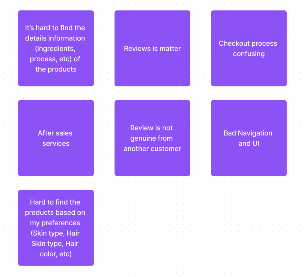
Let’s elaborate on these points and try to understand them in detail.
- Hard to find the details information of the products: Some Apps on the market, hide the information of the products details information. Or did not specify the details information of the products, for example, Ingredients. They just rely on product packaging information.
- Checkout Process Confusing: The checkout process is sometimes confusing when you did not give enough information about the step that needs to take or the discount that customers can get. Or just hard to find the Checkout Now button 🙂
- After-Sales Services: When you had bad luck and get broken products when they arrive at home, after-sales services take part. And it is matter. You can consult all the problems you faced, directly and immediately.
- Review is not genuine from the customer: The reviews that the customer reads, are sometimes not real from a real customer.
- Bad Navigation and UI: Customers need seamless apps that give them experience from opening the apps until the checkout process and the products arrive are seamless or easy to use.
- Hard to find the products based on my preferences: Some apps just did not provide these features. Or just give the customer the wrong information or products for the preferences they need.
This is detailed information about what the users are facing the issues and what they need in a better Beauty Online e-commerce app.
Brainstorming the solutions
Let’s take all the problems and ideate about the solutions for all the problems that are mentioned above.
Problem: Hard to find details information about the products
Solution: Make the product details information more prominent, so users can easily find it
Problem: Checkout Process Confusing
Solution: Make the process more seamless, and show the section title more prominent
Problem: After-Sales Services
Solution: Should design a simple UX flow where all the users can easily access Customer service.
Problem: Bad Navigation and UI
Solution: Create the buying and explore UX flow more seamless, so user experience leave the good experiences
Problem: Hard to find the products based on my preferences
Solution: Create the features that allow user to input the preferences, based on the problem they faced, and show product recommendation based on the preferences.
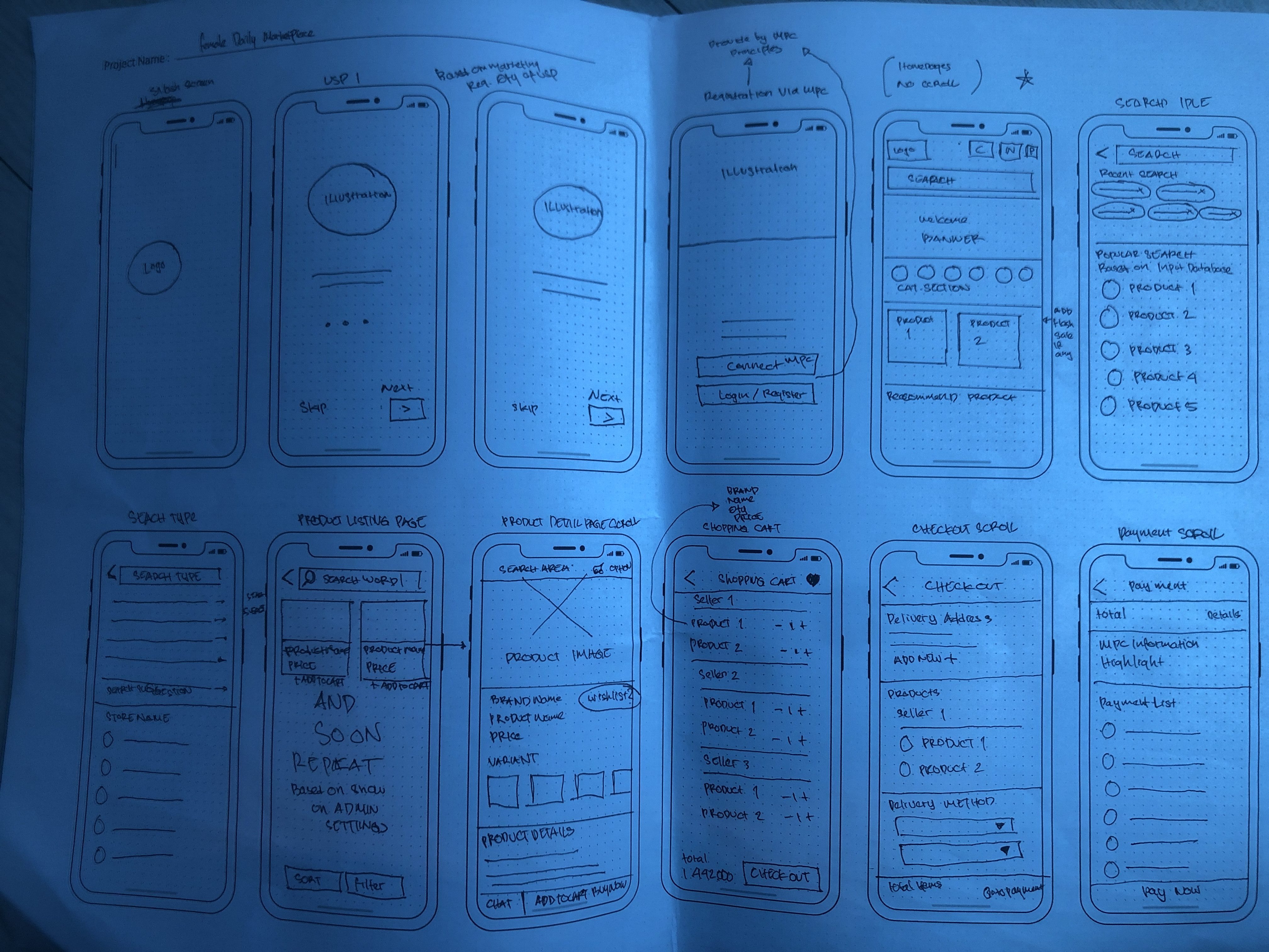
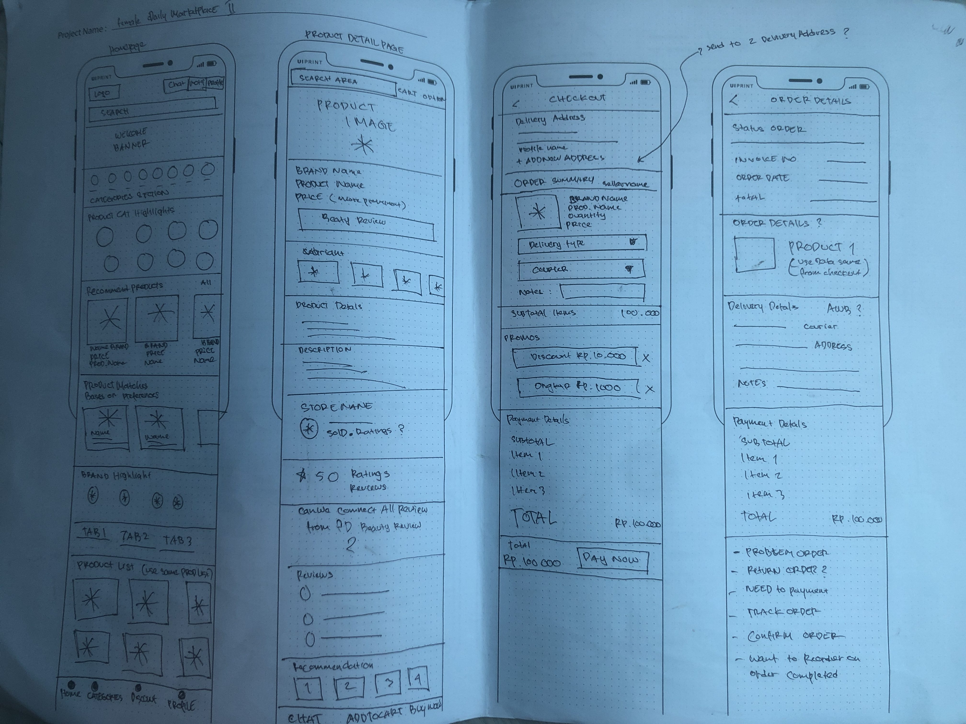
Using wireframes I put those bunch of ideas on paper first and then started to make them Low-fidelity wireframes and after dozens of corrections I came up with these wireframes.
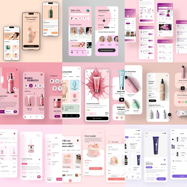
I feel a great way to start designing the best UI is by consuming a lot of great designs. I was having all the wireframes ready but the UI should be made with a lot of concentration so that it will be accessible to all customers. Not only these Screenshots, but I have also checked each and every app which is in the same category and tried to understand the usability of the apps and how they are making it easy for their users.
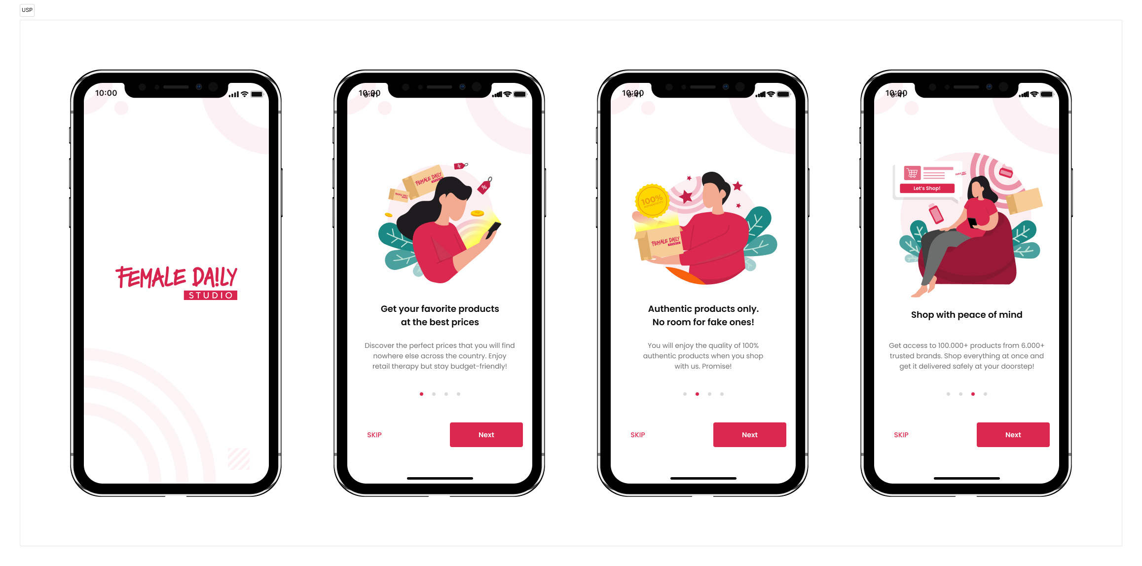
Our Flow
So before we jump in to Design Phase, I will tell you the 2 flows that we had, so I make them separate to get the bigger picture of the flow easier. Here is the flow :
- Order
This flow is completely normal like any other app where people can buy the product. So this journey starts with the customer opening the apps, then selecting a product, making a payment, and receiving the product. So I will make this journey easier because this journey is crucial and the core flow of the online shopping journey. - Beauty Profile
As I mention above, Female Daily users have some attributes attached to the user profile data to identify the user’s skin condition, such as skin type, skin tone, skin color, etc. There are also data beauty concerns for the user such as skin concerns, body concerns, and hair concerns. This data is necessary to offer the right product for the right user profile, so we can increase the chance of users buying the product as we provide a relevant product for them. Female Daily need features that allow the customer to input their Preferences, this is one feature that can problem-solve for that problem.
And I will tell you a few features and flow that we had in Female Daily.
| Primary #DA264D |
SCSS var $color-pink |
◯ |
| R 218 G 38 B 77 |
Pink Primary
| Teal #1B8884 |
SCSS var $color-teal |
◯ |
| R 27 G 136 B 132 |
Teal Primary
| Grey #ffffff |
SCSS var $color-grey |
◯ |
| R 218 G 218 B 218 |
Neutral Grey
| Black #0f0f0f |
SCSS var $color-black |
◯ |
| R 15 G 15 B 15 |
Moonlight Black
Typeface
Poppins
Usage
All Family
We select Poppins as a Main font-family that we used in this project.
The quick brown fox jumps over the lazy dog
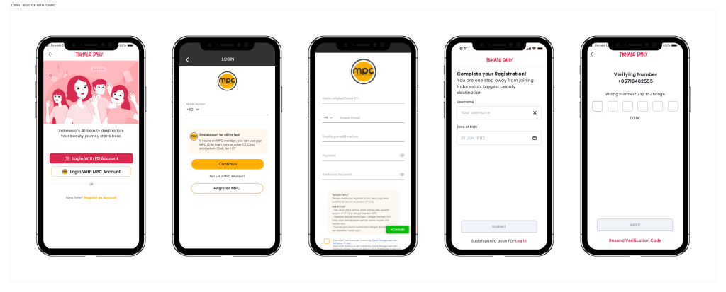
In this project, user can use their account from MPC (CT Corp Ecosystems Apps) and Female Daily Reviews to log in or Connect to the account. With these conditions, we can not use the usual login/register process as normally we do in another project. We need to adjust it to cater to the current Female Daily user database.
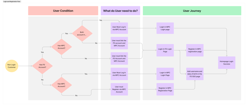
Below is an example of a UI from the Login and Register flow, you can see the process above to log in or register with an MPC or FD account.
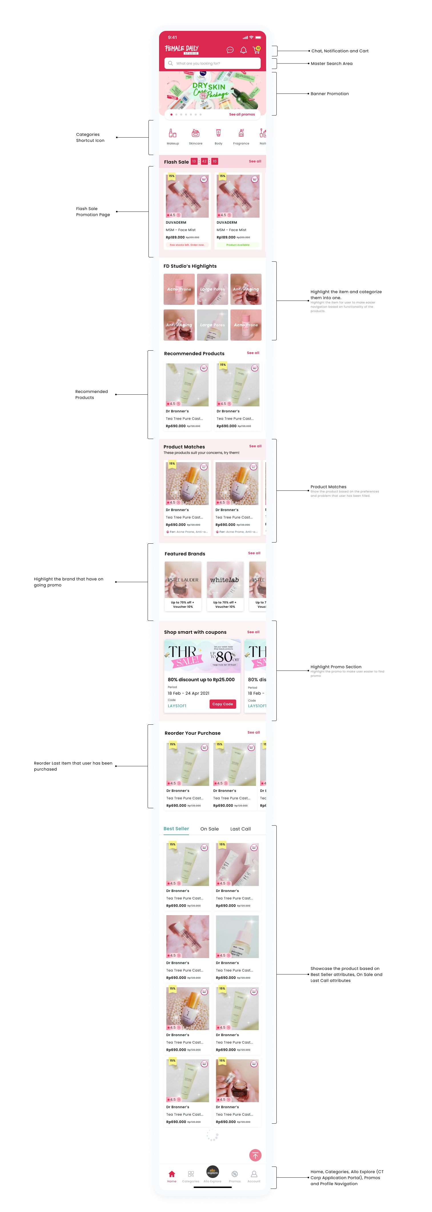
After numerous iterations, I have finally created a design for the Homescreen of the App. I understand the significance of this screen, as it serves as the main interface for users to access the App’s features and functions. Therefore, I have designed it with a minimalist approach and incorporated the findings from my research to make it more user-friendly and accessible.
Here is a detailed explanation of each element included in the Homescreen design:
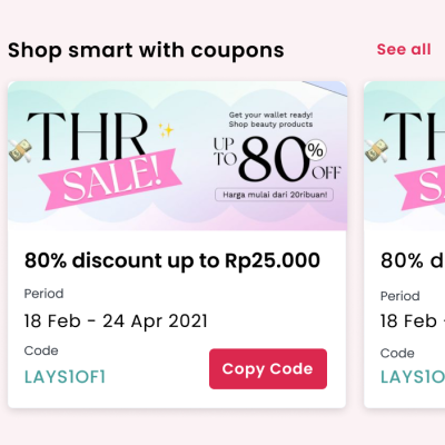
Now, let me tell you the problem that we try to solve, the first one is the problem of “Access to Promotions and Discounts”, which solves this problem or features that customers face in other apps. We try to create the Promo section in the Homepage design, so users can notice the discount they had and the discount that they can get on the first screen when their open the Apps for the first time.
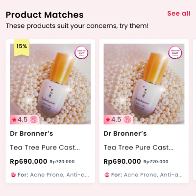
Let’s talk and focus on the problem of “Hard to Find the Products based on my preferences”. So in this case, I try to solve this problem. Major users think these features can be helpful, so let’s create this one with a feature that we called Female Daily Beauty Profile. As you can see after a few iterations, we create a section for products that recommend on the homepage based on user profile data like Skin Condition, Skin type, Skin tone, Skin color, etc. I will tell you the flow in the next section. So let’s jump into the Female Daily Beauty Profile Flow.
So this feature is to solve the problem that has been talked above, yes Female Daily Beauty Profile. So let me position myself as a user that wants and needs these features.
- As a Customer, I can complete my Beauty Profile, so that I can get a proper product recommendation based on my Beauty Profile.
- As a user, I want to edit my beauty profile so that I can fix any incorrect beauty profile data which allow me to get a more relevant product recommendation
Based on the details above, what is the best flow to cater to the user’s needs? Below is the flow that I has been created.
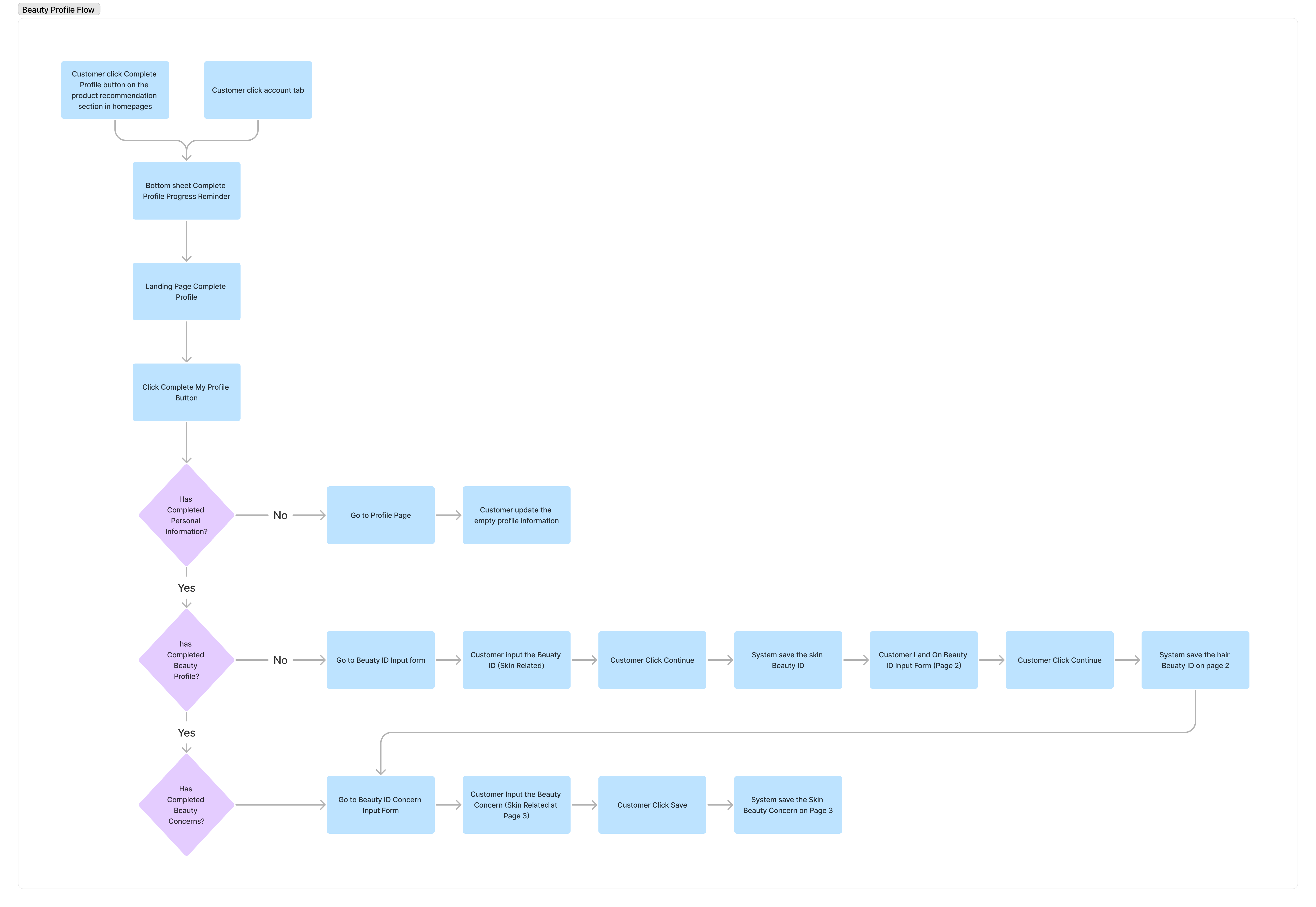
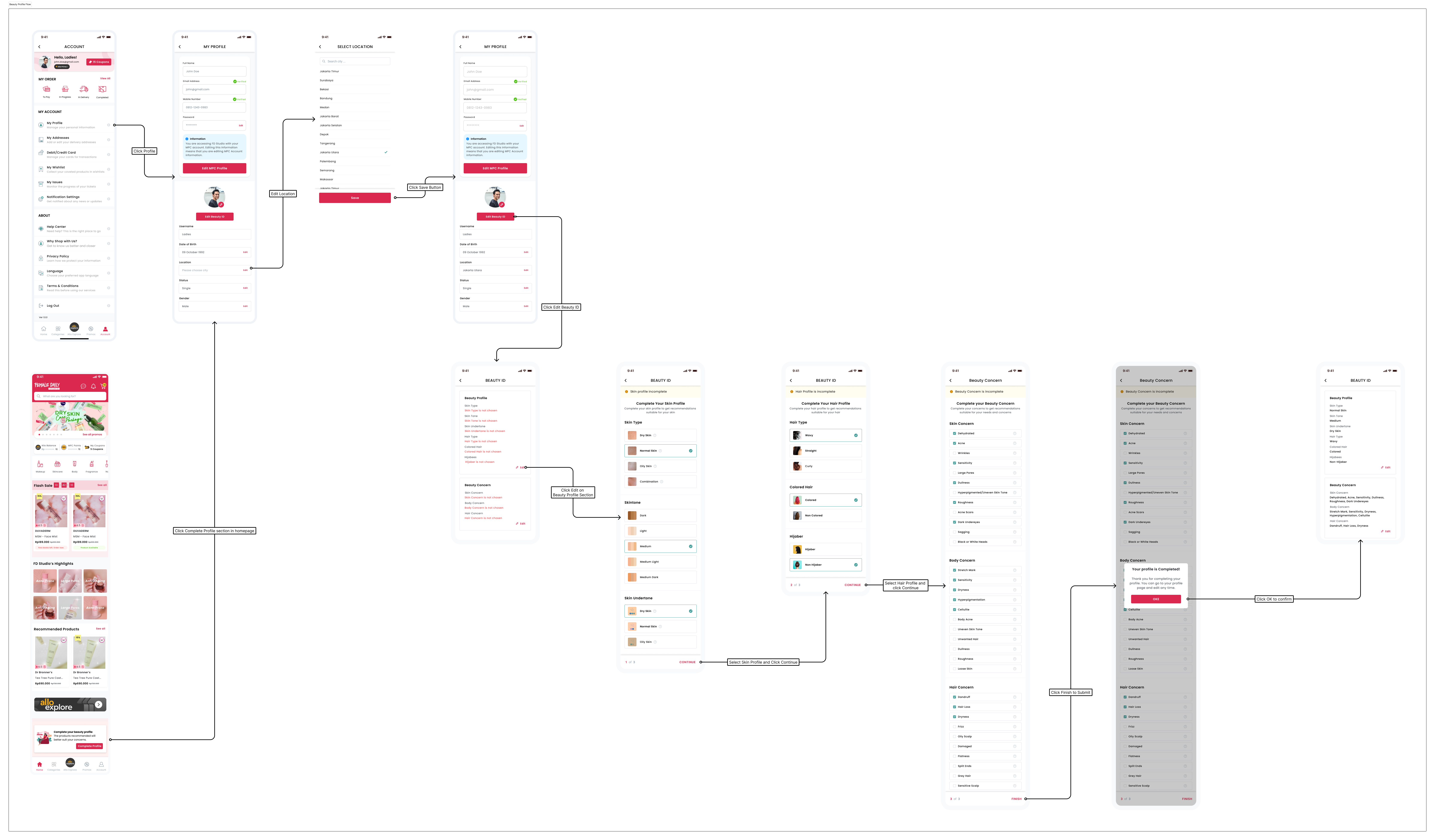
After a few iterations, we come up with this idea for the UI Hi-Fi Design of the Female Daily Beauty Profile. I provide 2 different entries to make users easier and faster to reach when they want to update the beauty ID, the first is from the homepage, and the second one is from the Profile Page. You can see the details below :
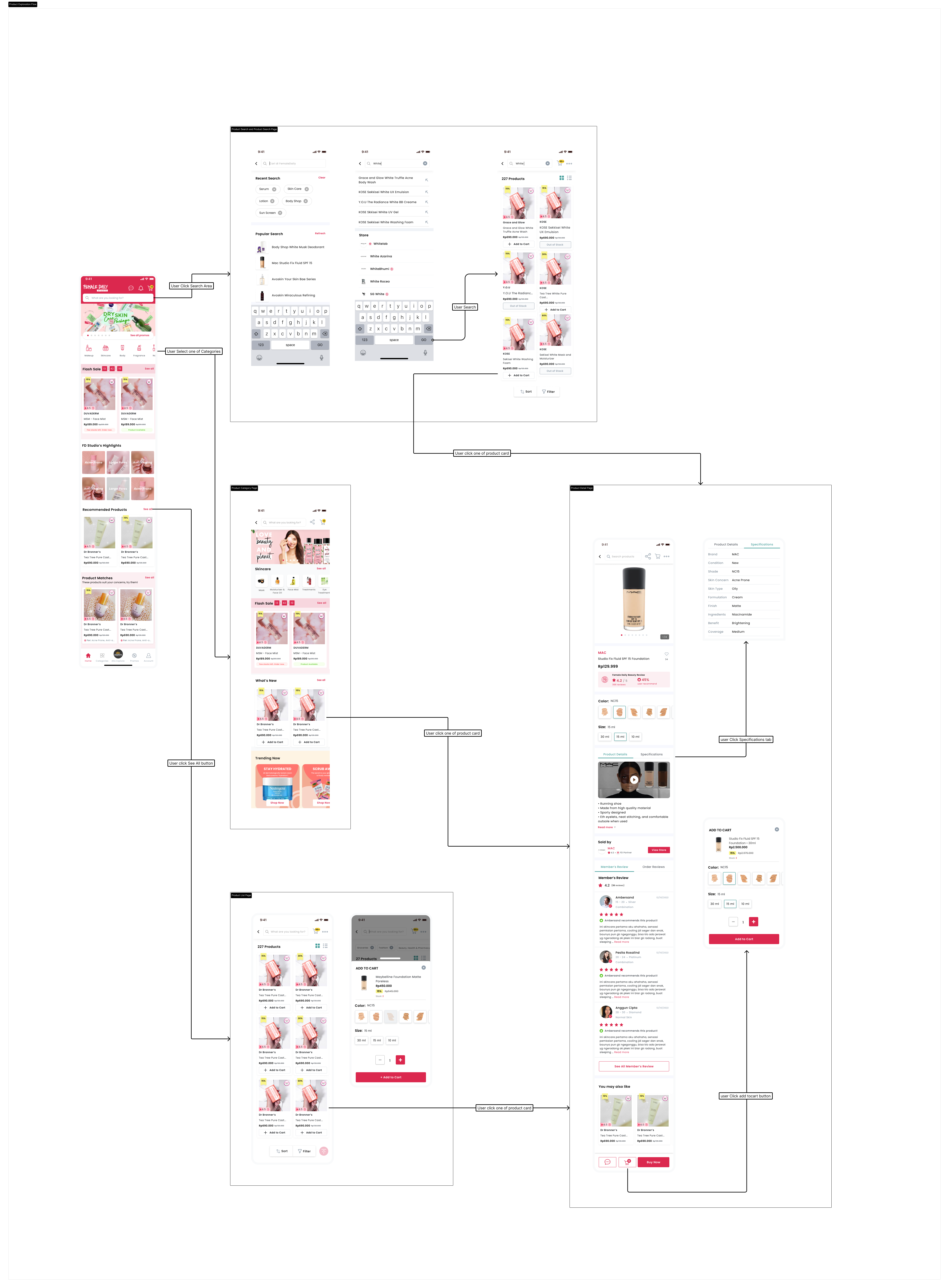
The flow that customers do is actually the same as the other usual apps do, from Search Product > Select the Product > Add Product to Cart > Checkout or Select Category > Select the Product > Add Product to Cart > Checkout. But there is another option depending on which entry point that user takes. But I add other information that I think will be useful for users. I will break down the information that you can see on the product listing page (PLP), product search page (PSP), product category page (PCP), and product detail page (PDP).
- The discount percentage, Users need to know every discount that they can get from the product if they buy the product, and combine it with another product. So I make the discount product more prominent and easy to catch when you see the Product Card.
- The Female Daily Beauty Awards (On the top right corner of the product image) and Female Daily Beauty Review (On the bottom left of the Product Image: Female Daily has a massive amount of product content that can be shown to customers to help customers decide which beauty product to buy, and one of the contents is the Member Review by Member and Female Daily Beauty Awards. That rich content comes from the segmented beauty community which is the strong point that can differentiate FD from its competitor. So it is important for the Marketplace of FD (Female Daily Beauty Studio) to be able to utilize the rich product content.
The utilization can be achieved by integrating with Female Daily Product ID (later on will be called FD Product ID). FD Product ID is an identifier that can link a product to the FD member reviews, FD product award label, FD product article, etc. By integrating this Female Daily Product ID into the created product in the FD Studio, the created product can be automatically linked to the FD Member Authentic Reviews. So I will tell you a glimpse of how to connect FD Member Review with FD Product Marketplace. From Product Creation (Admin and Seller side) to Product Display (Customer Facing). So the product card didn’t show the reviews from orders review in Marketplace but showed the Member Review from Beauty Community. - The other data point or information is just the same as any other usual app, like Brand Name, Product Name, and Product Price. But I add a button add to cart in the product list page to cut one step if the user wants to add the product directly and immediately from the product list page to the cart.
So below UI information is how we create the product on the Admin side:
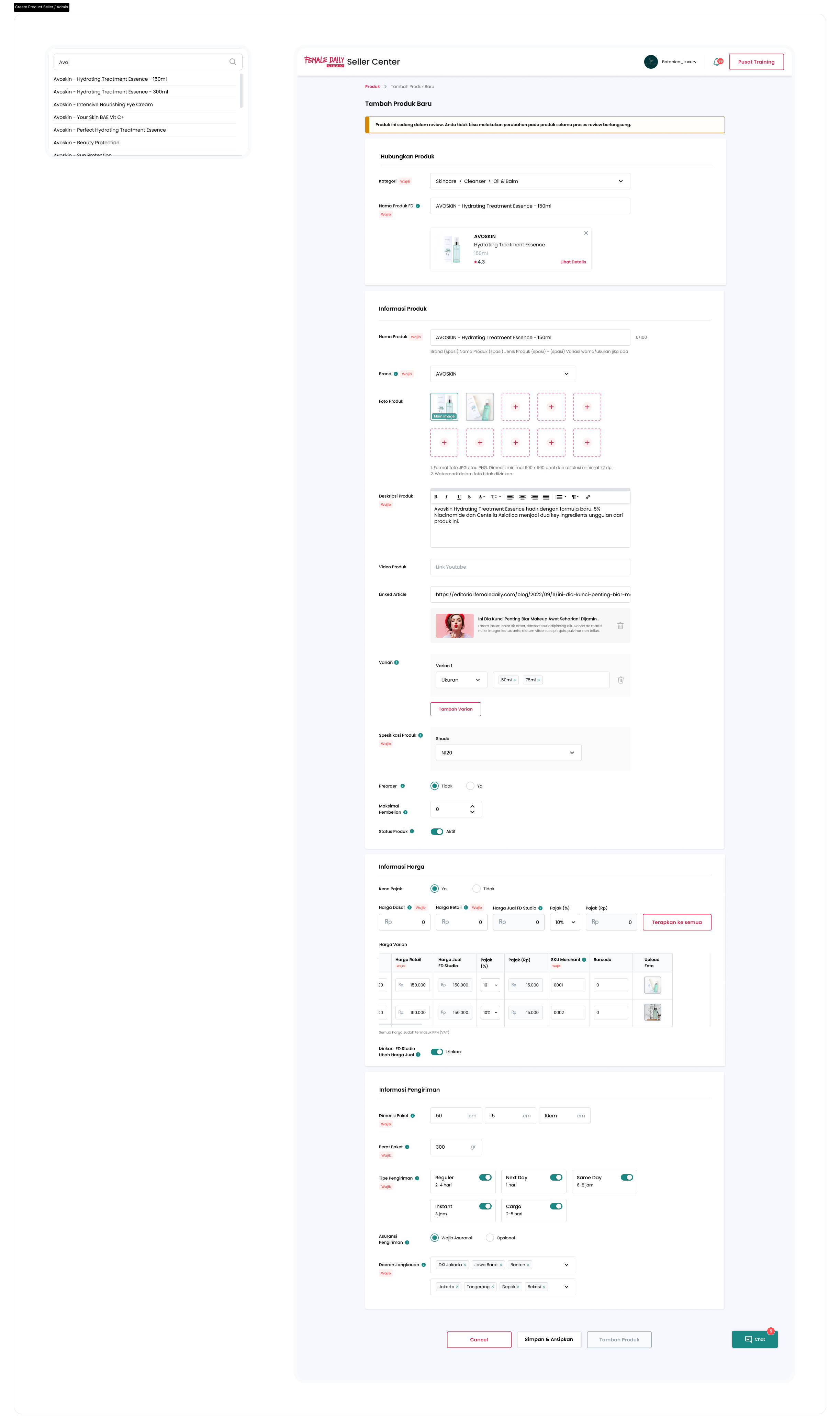
As you can see in the Hubungkan Produk section, there is an option for Product Category and Product Name that listed down all the products on the Female Daily Reviews database. So the user needs to select the product first, then create the product additional information for Female Daily Marketplace.
Below is the UI of the Product List Page and Product Search Page
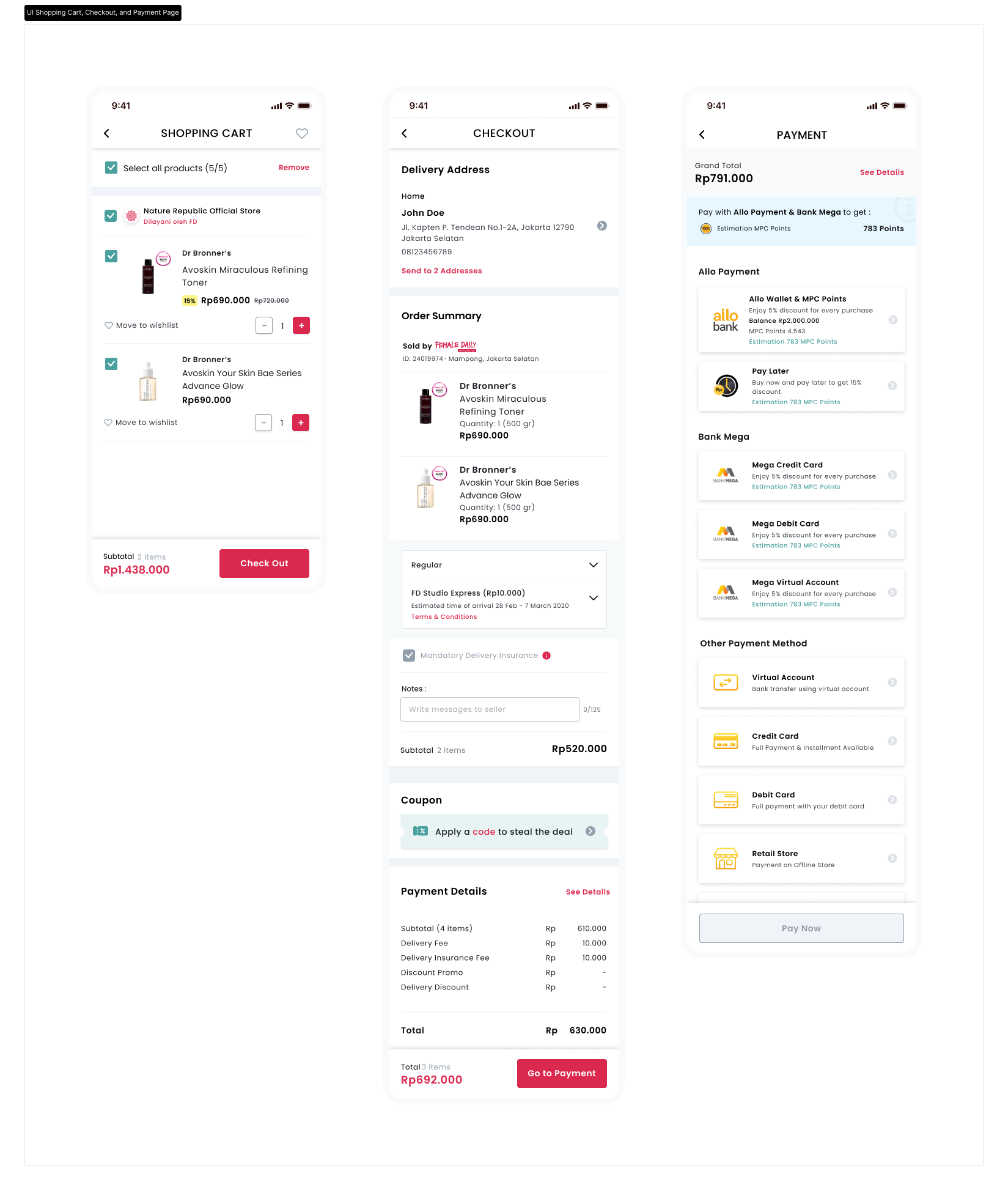
The current buying process UI and flow, it’s just the same as other usual e-commerce apps do, the process is starting from Shopping Cart > Check Out > Payment. That’s it. But based on the user interviews we come up with the idea, “How about we create a feature that allows users to send the items to different addresses on a single checkout process?” That we called a Send to multiple Address feature on the checkout page.
So we try to do another market research for this feature. And we come up with the insight. Introducing the feature “Send to multiple addresses” in our mobile online e-commerce app can offer several benefits to our customers and improve the overall user experience. Here are some reasons why we might consider implementing this feature:
- Gifting Convenience: Sending gifts to multiple recipients is a common scenario, especially during special occasions like birthdays, holidays, or weddings. By allowing users to send items to multiple addresses in a single order, you make it more convenient for them to handle multiple gifts at once, saving time and effort.
- Family and Friends: Families and friends living in different locations often collaborate to purchase gifts or share expenses. Allowing users to ship items to different addresses facilitates group buying (maybe our next feature), enhancing the social aspect of our app and encouraging more engagement.
- Special Occasions: During holidays or special events like Idful Fitri or Christmas, customers often buy items for multiple people at once. Enabling them to enter different addresses for each recipient simplifies this process and encourages them to shop more on our app.
- Customer Flexibility: Offering multiple delivery addresses gives users greater control over their orders and enhances the flexibility of our app, catering to a wider range of customer preferences.
- Enhanced User Experience: Implementing convenient features like this can set our e-commerce app apart from competitors, leading to higher customer satisfaction and increased loyalty.
- Marketing Opportunities: When customers use the “Send to multiple addresses” feature, they may share the news with others, indirectly promoting our app through word-of-mouth marketing.
And that’s the background of the “Why do we need this feature?” question. But as a team that uses a data-driven mindset, we need to prove this feature will going to work. How to test it? Yep, we need to do Usabilty Testing for these features. I will tell you on the next phase of How we do Usability Testing for our apps or features.
For now, I will tell you the flow of the Buying Process in our apps.
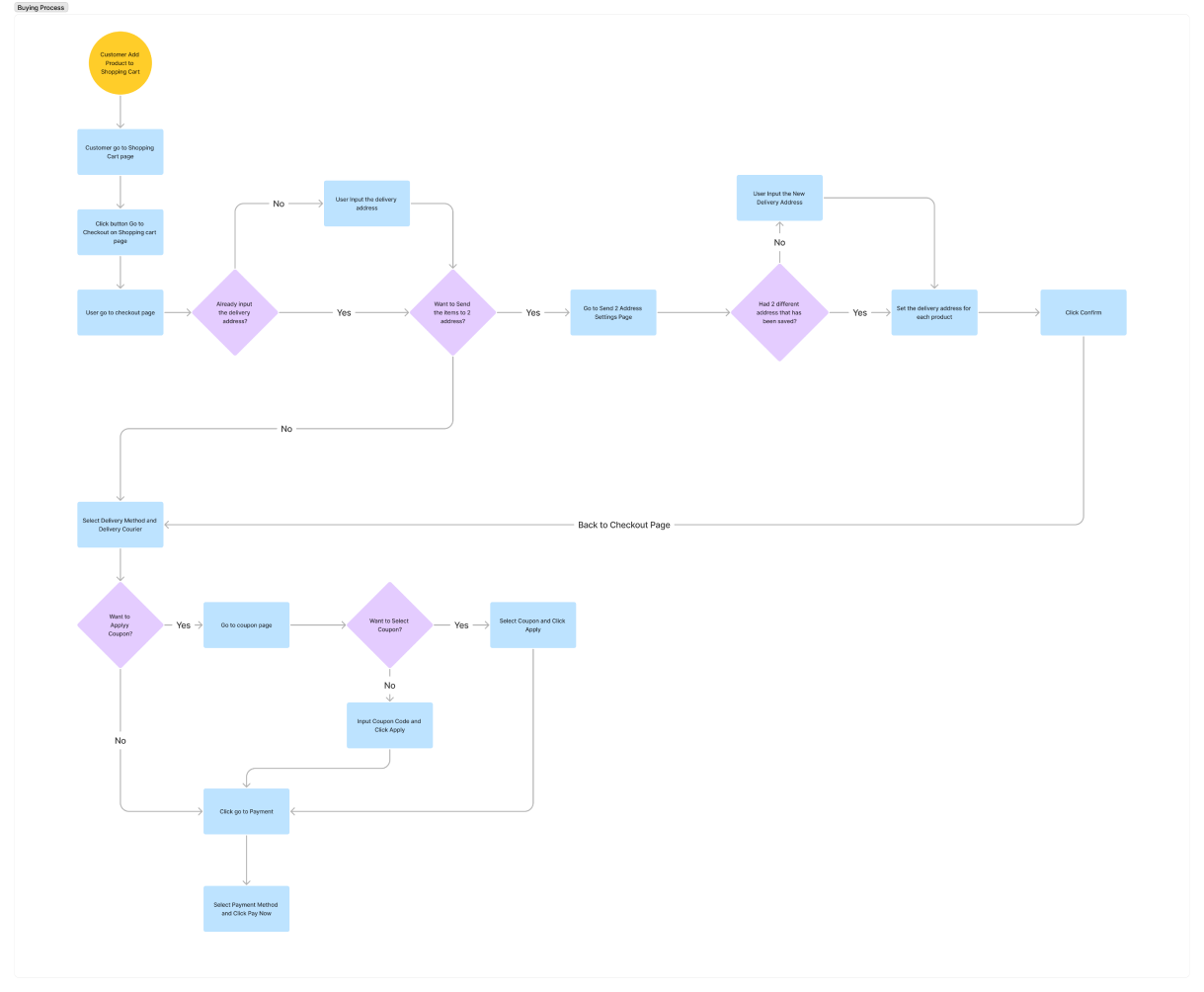
Above is the journey for a user to buy the product from Shopping Cart into Payment.
As you can see, there is an option that we give to users if they want to send the products to multiple addresses at once.
And here is the UI for Shopping Cart, Checkout and Payment.
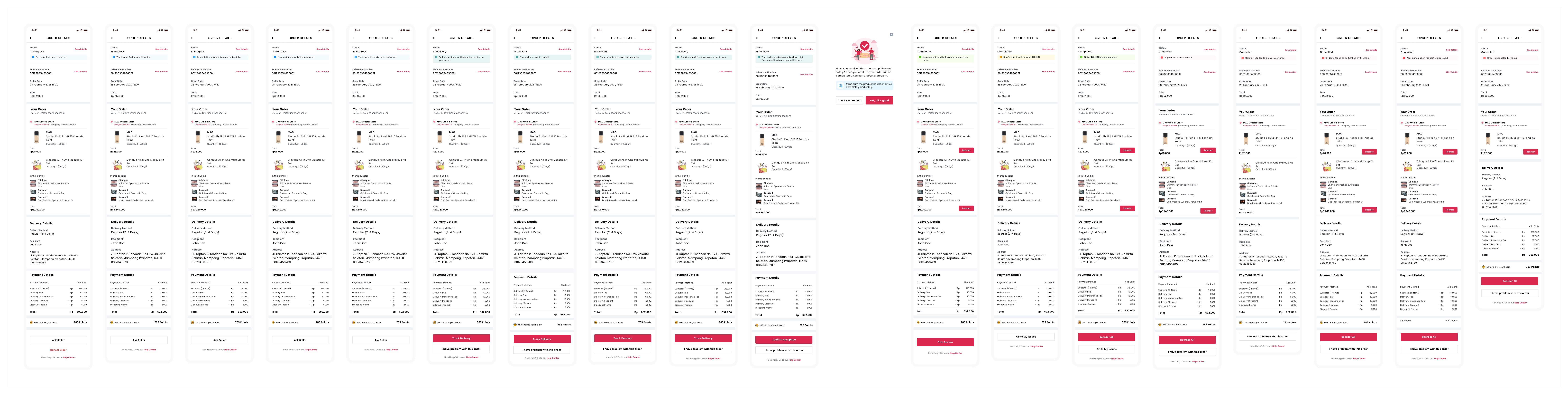
This one is Order Page when you can track you order and delivery status. I separate the journey from Customer making payment until the order has been received. As you can see on the image below, there is a few status to describe how far the order goes.
- Need Payment
- In Progress
- In Delivery
- Completed
- Canceled
And every status has a sub-status to show more details information to the customer.
I will break down one by one :
- In Progress
– Payment Has been received
– Waiting for Seller’s Confirmation
– Cancellation request is rejected by seller (if customer ask to cancel the order and the seller reject it
– Your order is now being prepared
– Your order is ready to be delivered - In Delivery
– Seller is waiting for the courier to pick up your order
– Your order is now in transit
– Your order is on its way with the courier
– Courier couldn’t deliver your order to you. (if the courier failed to deliver the customer’s product, then the courier will try on the next day)
– Your order has been received by Luigi. Please confirm to complete this order (if the customer has received the product. The status is got by 3rd party logistic API) - Completed
– You’ve confirmed to have completed this order
– Here’s your ticket number 1431231 (if the customer had a problem with the product)
– Ticket 1431231 has been closed (if customer problem has been solved) - Canceled
– Payment was Unsuccessful
– Courier is failed to deliver your order
– Order is failed to be fulfilled by the Seller
– Your cancelation request is approved
– Order is canceled by Admin
And there is a sub-status for every status on the order details page.
As you can see I add the Re-Order button on the order details page when the customer already received the product and complete the order. The re-order button can offer several benefits to both our customers and our business .Let’s explore these benefits:
- Convenience for Customers:
The “Reorder” button allows customers to quickly repurchase items they have previously bought without having to search for them again. This saves them time and effort, especially if they frequently purchase the same products. - Streamlined Repurchasing Process:
With the “Reorder” button, customers can initiate the repurchasing process with just one click. It eliminates the need to add items to the cart one by one, simplifying and accelerating the checkout process. - Encourage repeat purchases :
By offering a convenient way to reorder, we encourage repeat purchases from our loyal customers. Repeat business is crucial for e-commerce success, as it helps build customer loyalty and increases customer lifetime value.
And many more.
And that’s a brief explanation for the My Order Details page.
Below is the tracking process flow and User Interface from Need Payment until Completed status :
And that’s the end of the journey from the customer side. I will tell you in the next case study how I design the Admin dashboard and Seller dashboard.
The following images depict the major screens of the app, which have been prototyped at the component level. As a result, the images are free from clutter and provide a clear visual representation of each screen. This prototyping approach allows for a detailed examination of individual components and helps to ensure that the app has a streamlined, user-friendly design.
You can test the happy flow of the Prototype below :
The testing phase is a crucial part of the UX design process, as it provides the opportunity to evaluate the user experience of the app and identify any areas for improvement. The goal of this phase was to assess the usability, functionality, and overall user satisfaction with our app.
So I will break down every step we take to do Usability Testing. Here it is:
We using Useberry for our Usability Testing Platform, so we don’t need a fully running production application for this usability testing, we just using a current prototype that already we had and separate it into the task that we want the participant to complete.
We use moderated usability testing, and my role as a moderator with my colleague that join as an assistant and take a note. And we use in-person usability testing to get a deeper insight and pain-point that arise during the testing.
There are 2 features that we want to test. The first one is Female Daily Beauty Profile Recommendation and the second one is Send 2 delivery address. These features we had is unique selling point that we had to compare to competitors. So if you ask why not test the whole app or the whole journey? I will answer, not this time. As I mentioned before, our flow and journey are just the same as other usual apps do, so we think the user is already familiar with the flow and journey. We just test the features that we think are unique and different.
During the testing phase, participants were asked to perform a series of tasks using the app. Participants were also asked to answer questions about their experience with the app, including questions about the app’s usability, functionality, and overall satisfaction. The data collected during the testing phase was analyzed using a combination of quantitative metrics, such as task completion rates and time on task, as well as qualitative feedback from the participants. At the end of every task, we add a SUS Survey to get an effective and accurate usability score for every feature.

And here is the Scenario :
Send to 2 Delivery Addresses
MAC studio just releases a new foundation with SPF 15. You are interested to buy the product via online e-commerce. And you want to send the product to your friend and yourself within only one transaction.
For this scenario has 14 task, start with :
- Starting from homepages, users select the categories they want
- Select the Subcategories they want
- Select the product they want to buy from the product listing page
- Go to the product details page and click the button Add to cart
- The user clicks Shopping Cart and goes to the Shopping Cart page
- On the shopping cart page, the user set the quantity of the items and then clicks the Go to Checkout button
- User selects Send to 2 Address
- The user selects the address for each product and then clicks and submit
- Users need to select the Delivery Method
- Users need to select the Delivery Courier
- Select promo and apply promo
- Users need to click Go to Payment to proceed to the payment page
- Select Payment Method then confirm the method
- Finish
Female Daily Beauty Profile Recommendation
You are a newcomer to online shopping e-commerce, and you want to buy a product based on your current skin, hair, and concern that you currently had. Buy one product that represents your condition and concern that you had.
This scenario has 9 task, that starts from :
- Homepages, where access needs to click the complete profile in the beauty profile section
- Information about what to do and which to update on the Complete Profile page
- Users need to complete the profile on the My Profile page
- Users need to update the city where they live in
- Users need to access the Beauty ID page to get information about the status of the Beauty Profile.
- Users need to complete Skin Profile wizards
- The user needs to complete the Hair Profile wizards
- The user needs to complete the Beauty Concern wizards
- Finish the task
A total of 5 users were recruited for testing and here is the sample specification :
- ranging in age from 25 to 50 years old. Participants were selected based on their prior experience with online e-commerce apps, as well as their willingness to provide feedback on their experience with the app.
- Using Female Daily Application is the last 3 months
- Woman
- Indonesian
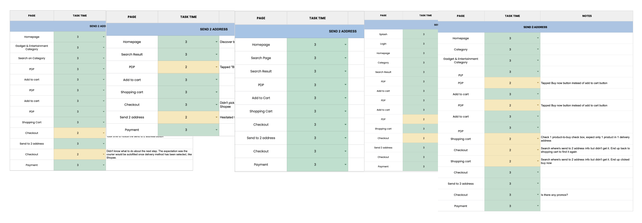
The results of the testing phase indicated that the majority of participants found the app to be easy to use and effective for shopping a beauty needs. Participants reported a high level of satisfaction with the app, with a satisfaction rate of 90%. However, some participants reported that they experienced difficulties with the app’s navigation.
And there is some new potential insight and feedback that we get from participants, here is the list :
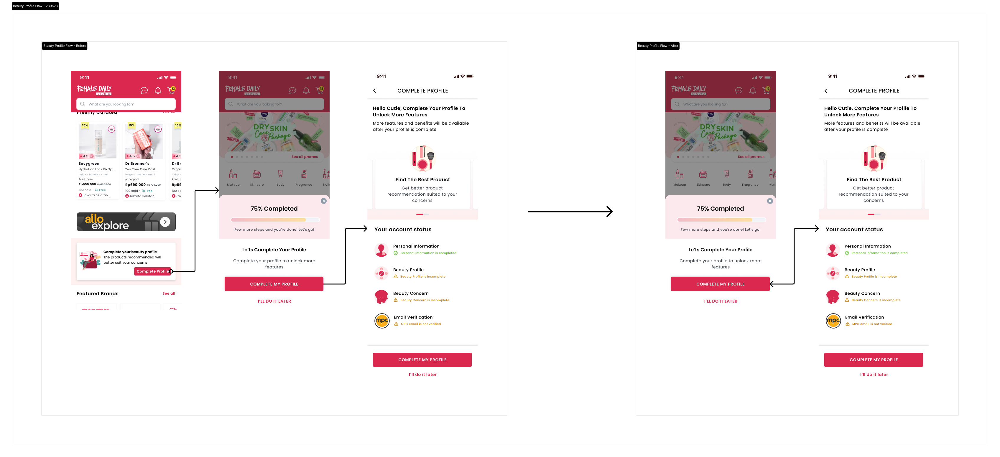
- “Hard to find the button to complete my profile on the homepage”
- “The Send to 2 address button is not stand out”
- “The Send to 2 Address features will help us on the special occasion”
- “Items that show on the product beauty recommendation section were easy to find and show the correct information based on my preferences
- “I will use the Send to 2 Address features frequently
With this feedback and insight that we get from participants, we try to create an improvement in our design. The part that we try to improve is :
Checkout Page
We agree that the button or CTA for Send to 2 Address is not prominent, it’s hard for the user to notice the button in the first time, so we try to create the button improvement for this part.
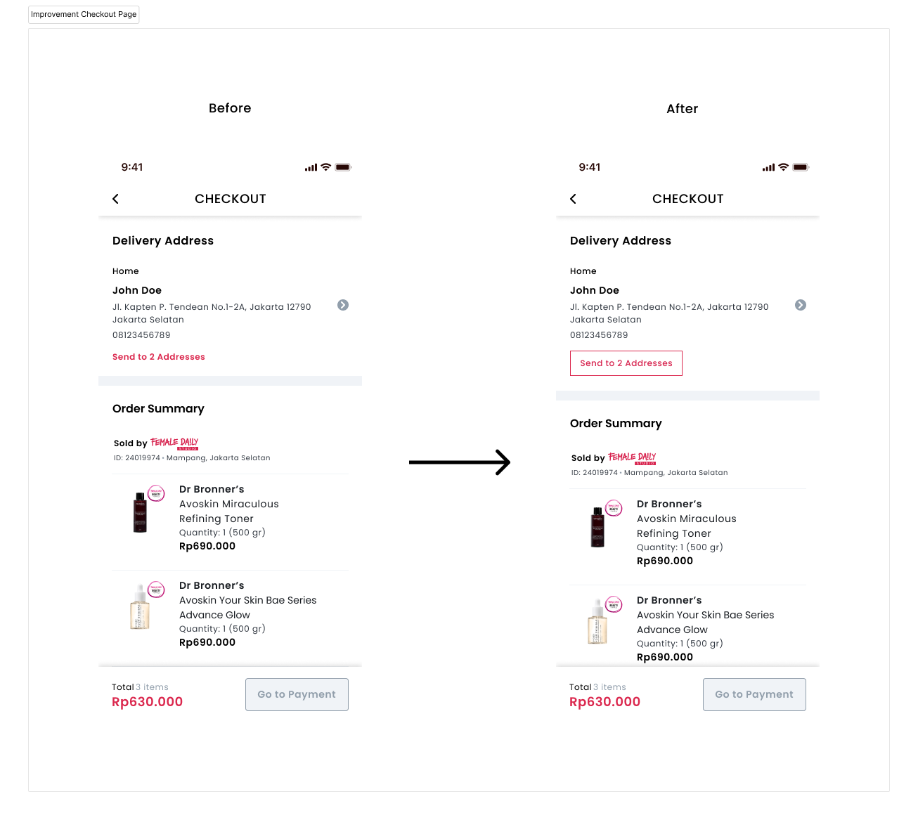
As you can see in the image above, we try to make an improvement on the button, from the text link into a secondary button in the address section.
Beauty Profile Product Recommendation
And on the other hand, some of the participants had a problem completing their profiles because of the lack of information shown in the first step. So we try to solve this problem by giving the Pop up information and CTA button on the homepage to complete the profile. Now pop-up information is shown on Homepage and just like before on the profile page. And we adjust the trigger to show the pop-up information from clicking the Complete Profile button on Beauty Profile section, now we add the pop-up on the homepage when they open for the first time. So the user gets the information directly without CTA as a trigger. And with a new flow that we provide, it cuts one step that users need to take to complete the profile from homepages.
This completes the sample testing phase for the UX case study of a Female Daily e-commerce app.
As a UX designer working on a e-commerce app, I have gained valuable insights and knowledge through the design process. Some of the key things I have learned include:
- Understanding user needs: The design process started with researching and understanding the needs and pain points of users. This helped me to identify the core features and functionalities that needed to be incorporated into the app.
- Importance of simplicity: While designing the app, I realized that it was important to keep the user interface simple and intuitive. A complex and cluttered design could lead to confusion and frustration for users.
- User feedback: Throughout the design process, I received regular feedback from users and made adjustments to the app accordingly. This helped me to ensure that the app was meeting their needs and expectations and to make any necessary changes to improve the overall user experience.
In conclusion, designing a Female Daily app has been a challenging yet rewarding experience that has allowed me to gain a deeper understanding of the needs of users and develop my skills as a UX Designer.