

Precycle Case Study
Precycle is an Indonesian-based subscription box service and online grocery store that specializes in selling “misfit” or “ugly” produce. The company’s mission is aligned with the idea of reducing food waste by rescuing and repurposing imperfect or surplus fruits and vegetables that would typically be discarded due to cosmetic imperfections or overproduction.
Task
Designing an online e-commerce app that connecting the farmer's and customer.
High Levels of Fruit and Vegetable Waste in Indonesia
Indonesia is one of the world’s largest producers of fruits and vegetables. However, unfortunately, much of this produce is wasted. According to the National Development Planning Agency (Bappenas), the amount of fruit and vegetable waste in Indonesia is estimated to be 115-184 kilograms per capita per year.
THAT’S HUGEEEE!!!
There are many factors that contribute to fruit and vegetable waste in Indonesia. One factor is inefficient production processes. Often, fruits and vegetables that do not meet size or quality standards are discarded. Another factor that contributes to fruit and vegetable waste is inefficient distribution processes. Fruits and vegetables that are not sold in the market are often discarded.
The high levels of fruit and vegetable waste in Indonesia have a significant impact on the environment and the economy. Environmentally, the high levels of fruit and vegetable waste produce greenhouse gas emissions that contribute to climate change. Economically, the high levels of fruit and vegetable waste represent a loss of valuable resources.
The mobile app aims to tackle food waste at grocery stores by connecting users with discounted “funny-looking” or imperfect yet perfectly nutritious food items that might otherwise go to waste due to outdated beauty standards. The app’s mission is to provide users with an opportunity to purchase these food items at a reduced price and give them a new home, thereby preventing unnecessary waste and promoting a more sustainable and inclusive food system.
So what are the goals and this platform needs?
The goals of this project are to create:
“The platform that connects the farmer and the buyer in one single platform to prevent imperfect but edible fruits or veggies from going to waste.”
By achieving this goal, the mobile app effectively addresses the issue of food waste at the farm level, connects consumers with discounted nutritious produce, and contributes to building a more sustainable and mindful food system that values all shapes and sizes of fruits and vegetables.
For this case study, I have chosen to utilize the Design Thinking process. This approach was selected as it is an effective methodology and mindset when tackling complicated issues, especially those that are centered around human needs. By using Design Thinking, I aim to find the best solution to this challenge in a user-centered manner.

There are 5 Stages in the Design Thinking Process:
Empathize →Define → Ideate →Prototype → Test
I will explain each and every phase in detail and try to elaborate on research I have done to improve the experience of Precycle app. In this case study, I only highlight the customer perspectives, for the MVP we try to create for the customer first, and from the farmer site, we try to approach it in the conventional way (WhatsApp). That’s becoming the problem when we can’t have real-time stock. So what’s the approach and the solution?
I decided to do quantitative research first to see to validate the hypotheses that I gain from the literature and UX study case. After that, I go with qualitative to validate the quantitative result and dive deeper into the opportunity that the user really needs.
So in this case I try to approach by doing User Research. I try to do Market Research but not getting enough information as Precycle still does not have competitors in Indonesia or the same business model.
For quantitative, I created a Google form and did random sampling with as many people can I get to validate my hypotheses.
The result from 32 participants validates which hypothesis is right and which one is wrong :
- How often do you buy fruits and vegetables?
- Every day (15%)
- 3-4 times a week (30%)
- 1-2 times a week (35%)
- Once a week (10%)
- Less than once a week (5%)
- What are the main reasons why you buy fruits and vegetables?
- The taste (15%)
- For health (40%)
- For convenience (35%)
- For appearance (5%)
- Other (please specify) (0%)
- Would you be willing to buy fruits and vegetables that do not meet size or quality standards and are ugly?
- Yes (25%)
- No (35%)
- Maybe, if they were priced lower (47%)
- Maybe, if they were marketed differently (3%)
- What factors would influence your decision to buy fruits and vegetables that do not meet size or quality standards and are ugly?
- Price (55%)
- Marketing (5%)
- Taste (3%)
- Health benefits (1%)
- Other (please specify) (0%)
- What are your thoughts on the environmental and economic impacts of food waste?
- It is a serious problem that needs to be addressed. (100%)
- It is not a big deal. (0%)
- I am not sure. (0%)
with this result, I decided to do qualitative based on the quantitative.
These are the Questions I asked in the User interviews:
- Are there specific types of fruits or vegetables that you would be more inclined to purchase as “misfits”? If yes, which ones and why?
- How important is the discounted price in influencing your decision to buy misfit produce?
- What level of imperfections in the produce would you find acceptable or unacceptable for purchase?
- Are you interested in learning more about the positive environmental impact of buying misfit produce?
- Would you prefer the option to select a custom mix of misfit produce or receive pre-selected boxes/bags?
- What other features or benefits could we offer to make purchasing misfit produce more appealing to you?
These are the basic questions I started the interview with, and every question has many follow-up questions based on their answers.
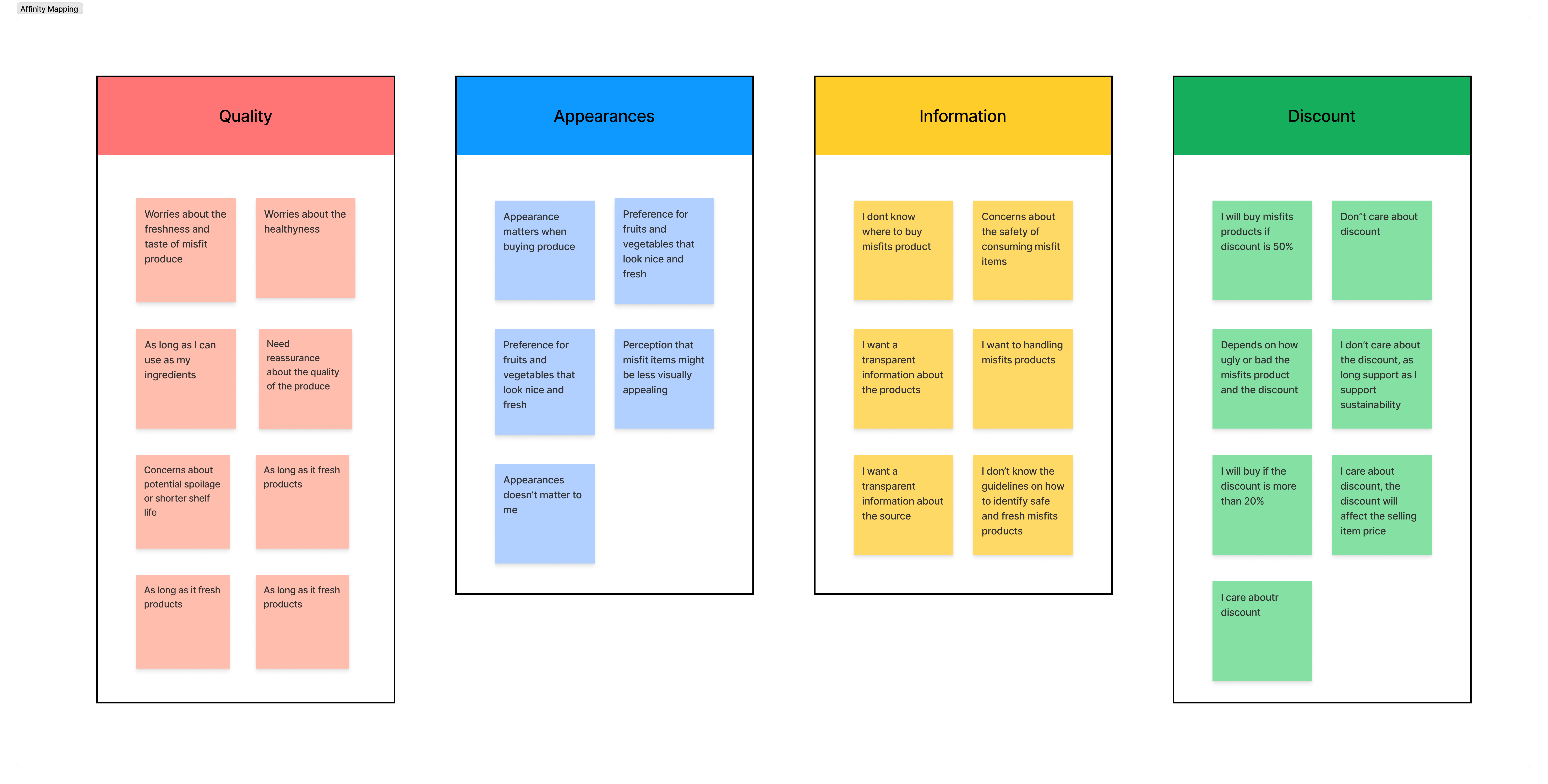
Key Insight and Pain Points
- Quality and Freshness Reassurance: Users have concerns about the freshness and taste of misfit produce. Providing clear reassurance about the quality, safety, and shelf life of misfit items will be crucial to gaining their trust and encouraging purchases.
- Addressing Appearance Concerns: Appearance matters to users when buying produce. To overcome hesitation related to the appearance of misfit items, consider highlighting their nutritional value, taste, and cooking potential. Showcasing visually appealing images and success stories can also challenge negative perceptions.
- Transparent Information and Guidelines: Users want transparent information about where to buy misfit produce and how it’s sourced and handled. Providing clear guidelines on how to identify safe and fresh misfit items will increase their confidence in making purchases.
- Discounts and Sustainability as Motivators: Offering discounts is an effective way to attract users to try misfit produce. Highlighting the positive impact on reducing food waste and supporting sustainable practices resonates with environmentally-conscious users.
- Educational Content and Cooking Tips: Users are interested in learning about the benefits of misfit produce and how to use them effectively. Providing educational content, cooking tips, and recipes tailored to misfit items can encourage more creative and enjoyable use of the produce.
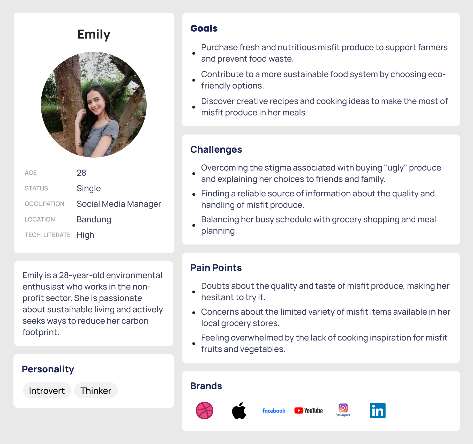
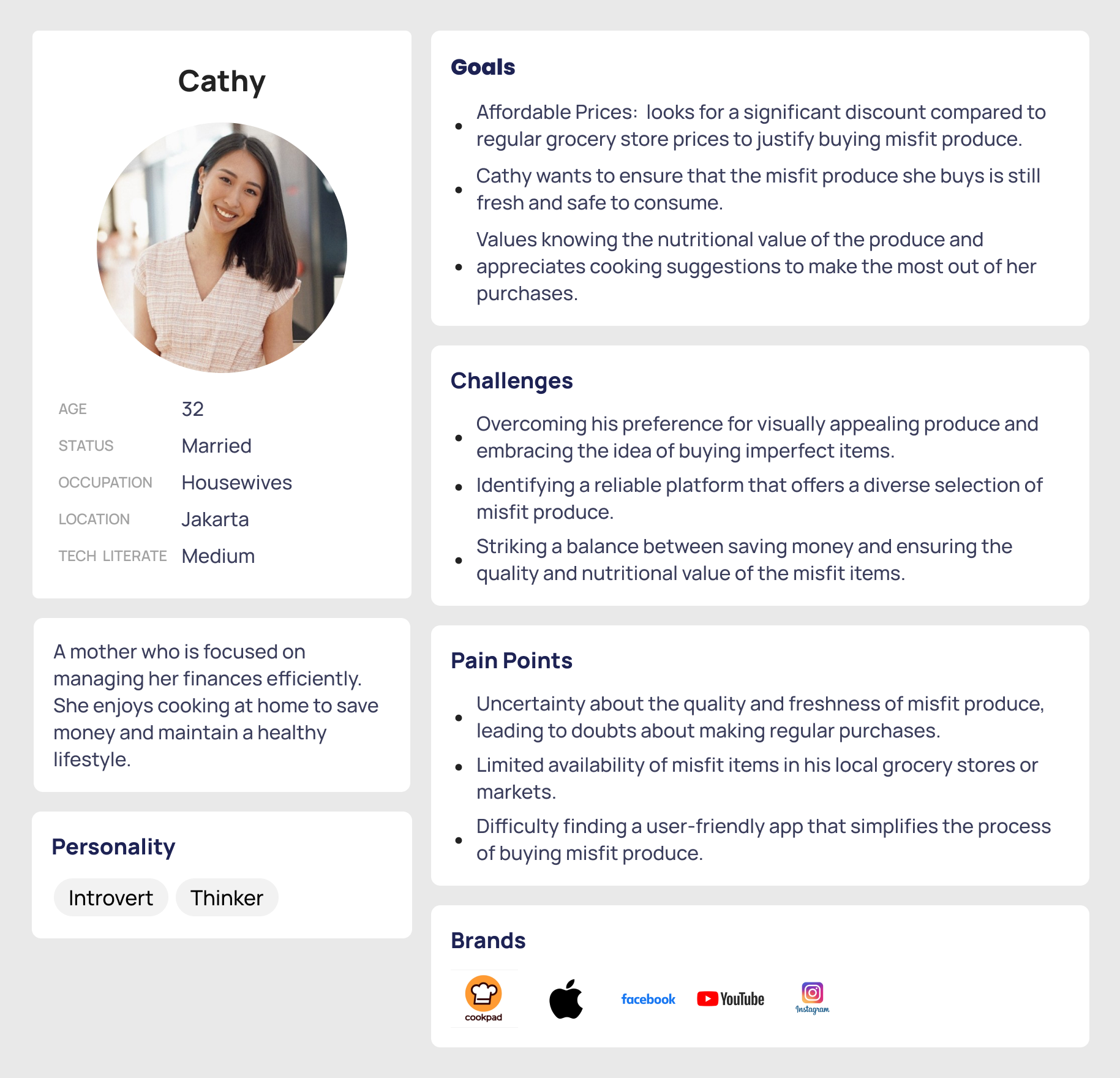
I find twopersona that already cover the people that I interviewed about food waste. With this persona, I design the ideation.
I have got all the key insights from the User interviews, now let’s understand all the pain points and define the actual problems that a designer can solve.
I have asked a lot of people what makes them not buy online misfits products, and the majority of people answered “Didn’t know the quality of the Products and Lack of Information”.
Based on the information that I get from Research, I can summarize the problem that we can solve into 3 points.
- Quality and Taste Concerns: Users may worry that misfit produce might not be as fresh or tasty as the “perfect” ones they are accustomed to. The uncertainty about the quality can deter them from trying misfit items.
- Hesitation Due to Appearance: Users might hesitate to buy misfit produce based on its appearance. They may prefer visually appealing fruits and vegetables and perceive misfit items as less desirable.
- Lack of Information and Transparency: Users may face challenges in finding information about where to buy misfit produce and how it’s sourced and handled. The lack of transparency can create doubts about the safety and authenticity of the misfit items.
This is detailed information about what the users are facing issues and what they need in our apps.
Brainstorming the solutions
Let’s take all the problems and ideate about the solutions for all the problems that are mentioned above.
Problem: Quality and Taste Concerns
Solution:
- Quality Assurance Information: Provide detailed information about the quality assurance process for misfit products. Include descriptions of how the produce is selected, handled, and stored to ensure its freshness and safety. Highlight any certifications or quality standards that the produce meets.
- Customer Reviews and Ratings: Allow users to leave reviews and ratings for the misfit produce they purchase through the app. Positive reviews from other customers who have tried and enjoyed the items can build trust and confidence in the quality of the produce.
- Product Descriptions and Photos: Include comprehensive product descriptions for each misfit item, mentioning its taste, texture, and nutritional benefits. High-quality images showcasing the misfit produce in its fresh state can give users a better idea of what to expect.
Problem: Hesitation due to appearance
Solution:
- Educational Content on Misfit Produce: Include a section in the app that provides educational content about misfit produce. Explain the concept of misfits, the reasons for their appearance, and their nutritional value. By educating users about the benefits and importance of embracing misfit produce, you can challenge negative perceptions and hesitations related to appearance.
- Before-and-After Images: Showcase before-and-after images of misfit produce to demonstrate how minor imperfections or differences in size do not affect the overall taste and quality. Visual comparisons can help users see that misfit items are still perfectly edible and nutritious.
- Success Stories and Testimonials: Feature success stories and testimonials from users who have purchased and enjoyed misfit produce through your app. Hearing positive experiences from others can build confidence in users and encourage them to try misfit items themselves.
Problem: Lack of Information and Transparency
Solution: Actually we can use the same solution with problem number 1. But I add other features that may solve this problem.
- Farmers’ Profiles and Stories: Create profiles for the farmers or growers who supply misfit produce to your app. Include their stories, sustainable farming practices, and efforts to reduce food waste. This feature humanizes the process and connects users with the people behind the product.
After setting up the project solution. I want to continue building up the structure of the apps using the sitemap. A sitemap helps me to visualize the relationship between the content and examine the hierarchy.
Using wireframes I put those bunch of ideas on paper first and then started to make them Low-fidelity wireframes and after dozens of corrections I came up with these wireframes.
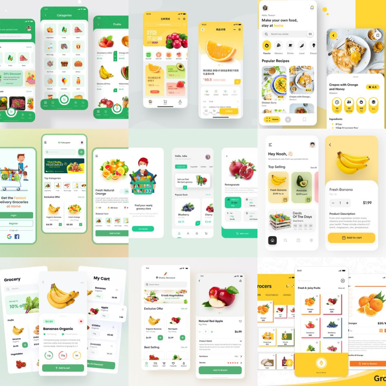
I feel a great way to start designing the best UI is by consuming a lot of great designs. I was having all the wireframes ready but the UI should be made with a lot of concentration so that it will be accessible to all customers. Not only these Screenshots, but I have also checked each and every app globally which is in the same category and industry and tried to understand the usability of the apps and how they are making it easy for their users.
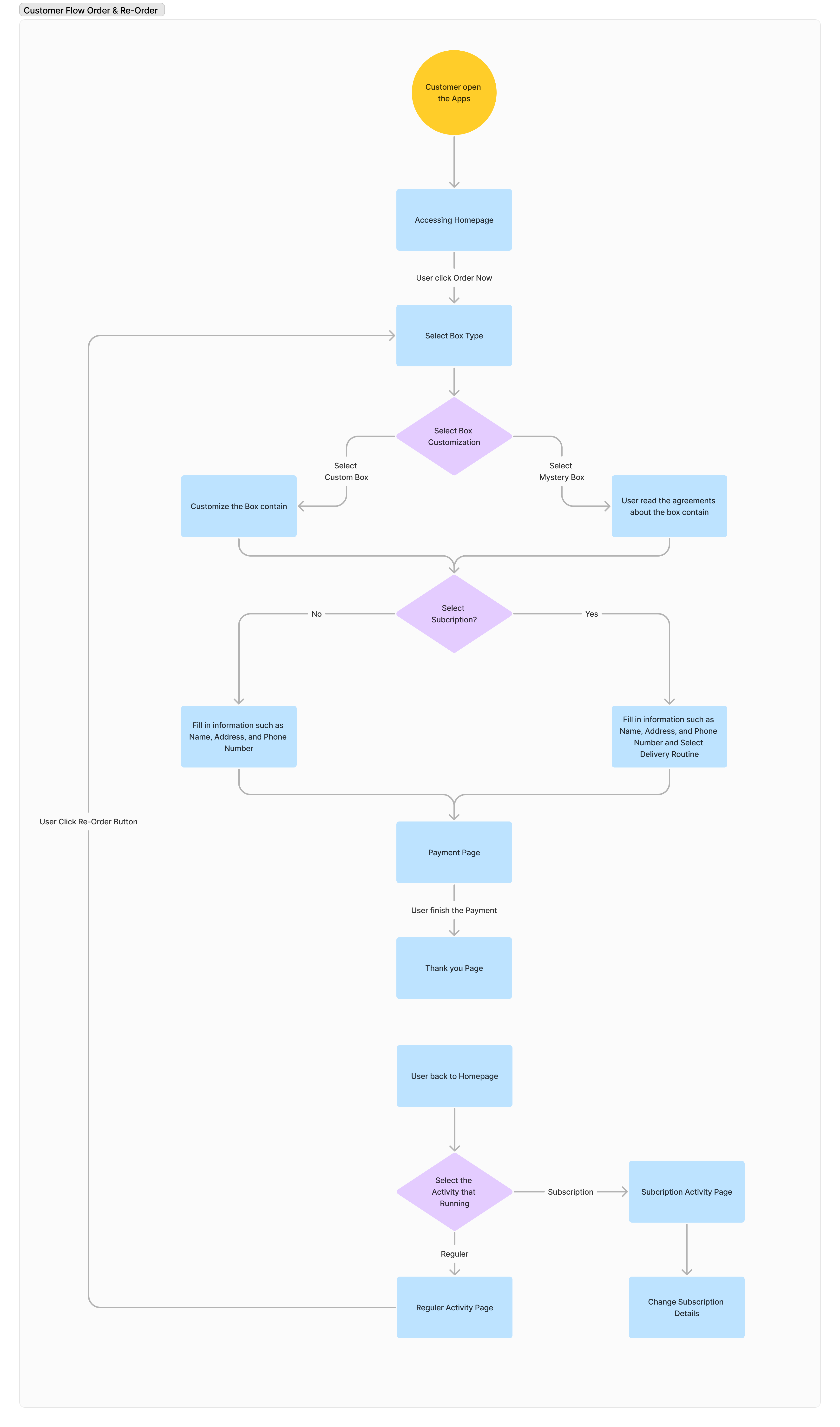
So I try to create the flow based on the user journey starting from the user opening the apps > select box > payment.
Another piece of information is, after discussion with stakeholders, the payment features are provided with 3rd party Payment Gateway. So I won’t design the payment flow.
And I should remind you that we had time constraints with a platform that we should build for the farmer side. So it will be the future step and future features that we need to create. With that limitation, I try to create and breakdown the MVP features.
After discussion with stakeholders, we agree that :
- Order Journey Flow (from Open the Apps until the customer creates order) is set to Must Have – High
- Farmer Dashboard is set to Must Have – Medium
- Inspiration and recommendation flow is Nice to Have
- Change from Regular Order to Subscription is Nice to Have
With the main focus and priority that we had set, I try to create the end-to-end user journey and flow.
Here is the flow :
| Primary #FEBE50 |
SCSS var $color-yellow |
◯ |
| R 254 G 190 B 80 |
Yellow Bee
| Teal #5C6301 |
SCSS var $Green Ocean |
◯ |
| R 92 G 99 B 1 |
Teal Primary
| Grey #ffffff |
SCSS var $color-grey |
◯ |
| R 218 G 218 B 218 |
Neutral Grey
| Black #0f0f0f |
SCSS var $color-black |
◯ |
| R 15 G 15 B 15 |
Moonlight Black
I use yellow color as my Primary Color,
According to Hard, yellow is the fastest color to be processed by the human brain.
Yellow is an appetite stimulant, yellow also has a very optimistic feel to it. Perhaps because of its resonance with the sun’s electric energy, yellow transmits a sense of positivity and happiness. That’s why I use a yellow color in this project, and paired with Green Color, the color of Veggies :3
Typeface
Gilroy
Usage
All Family
We select Poppins as a Main font-family that we used in this project.
The quick brown fox jumps over the lazy dog
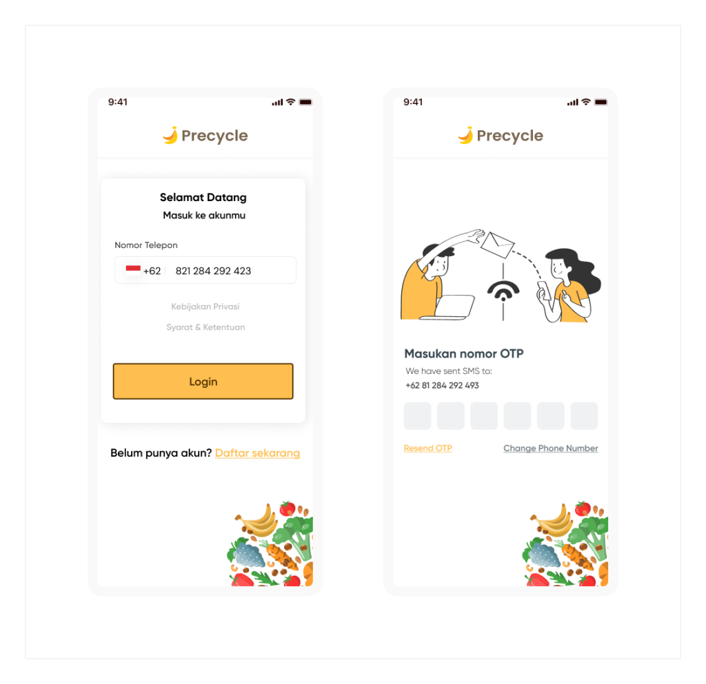
I try to create a simple and intuitive Login and Register screen. In this Login screen, you just need to input your phone number > make sure the OTP has been sent to your phone and filled the OTP correctly > go to the homepage. That’s it.
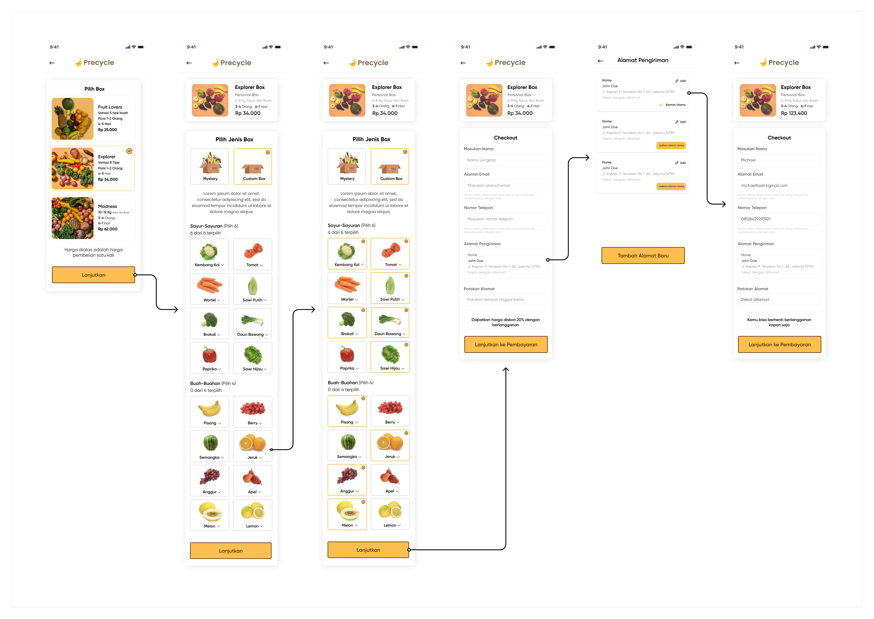
As I mentioned above in the User Flow, we had two types of orders, the first one is Regular and the second one is Subscription. So I will separate the flow into 2.
Below is the Regular flow:
This one is a Subscription Journey. But, you can change the type from Regular to Subscription, just by clicking the button Regular Order. It will switch into the subscription. This will make the flow user-friendly and easier when they misclick or just change their mind. Here is the flow :

I add the information about the farmer as a solution for the problem of “Transparency”. On the BOX page, you can see the real image that will be used to describe how fresh the product is and solve the problem that the user is concerned about.
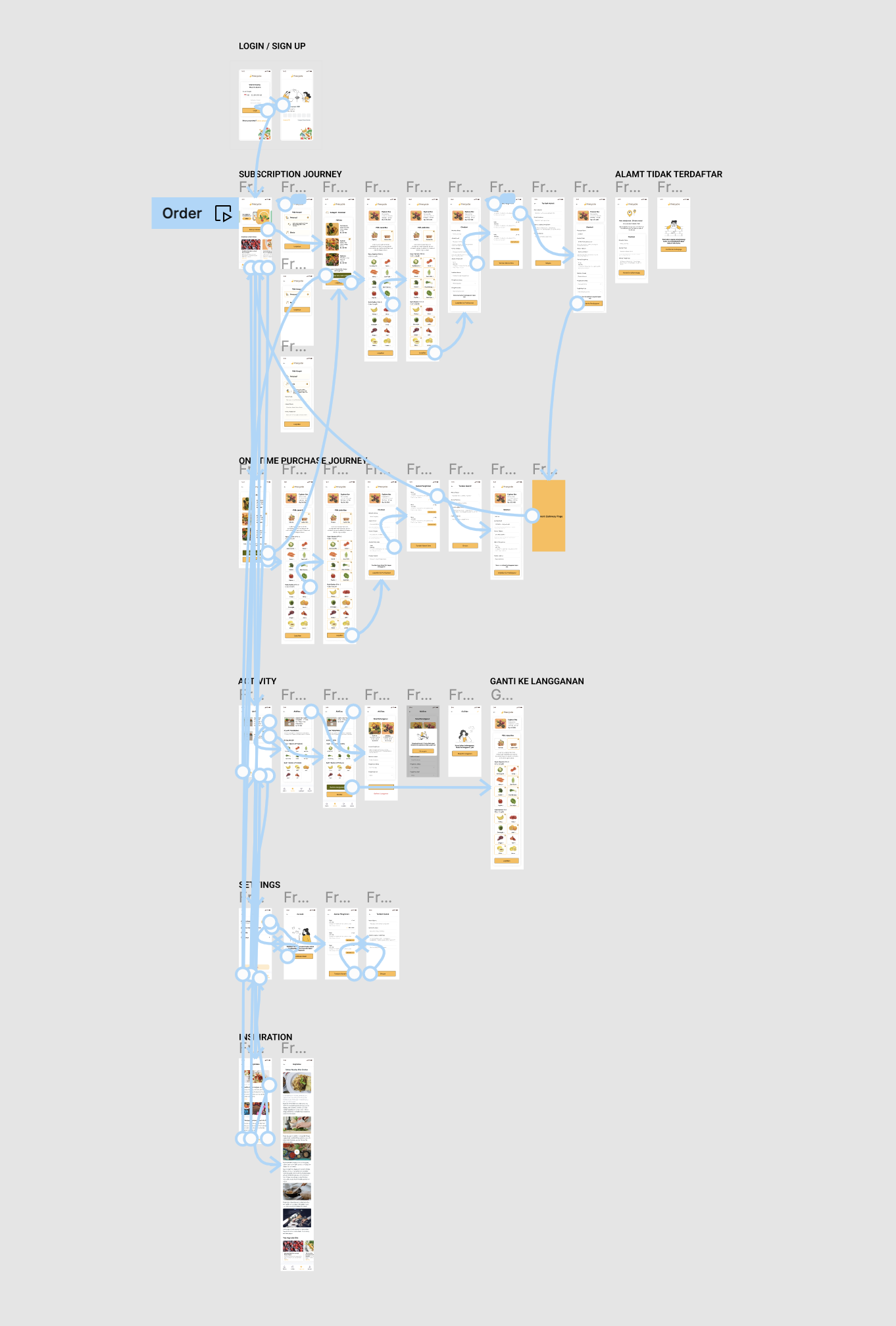
The following images depict the major screens of the app, which have been prototyped at the component level. As a result, the images are free from clutter and provide a clear visual representation of each screen. This prototyping approach allows for a detailed examination of individual components and helps to ensure that the app has a streamlined, user-friendly design.
You can test the happy flow of the Prototype below :
The testing phase is a crucial part of the UX design process, as it provides the opportunity to evaluate the user experience of the app and identify any areas for improvement. The goal of this phase was to assess the usability, functionality, and overall user satisfaction with our app.
So I will break down every step we take to do Usability Testing. Here it is:
We using Useberry for our Usability Testing Platform, so we don’t need a fully running production application for this usability testing, we just using a current prototype that already we had and separate it into the task that we want the participant to complete.
We use moderated usability testing, and my role as a moderator with my colleague that join as an assistant and take a note. And we use in-person usability testing to get a deeper insight and pain-point that arise during the testing.
I want to test the end-to-end journey, to get feedback from the overall apps and features. So I will give them one scenario that cover all the screen that I want to test.
The scenario is :
“Buy a customized box product from Precycle apps. You are free to try all the features of this app.”
So the task will be :
- Starting from the homepage
- Select the Box type
- Select the order type (Regular / Subcription)
- Add fruit and Vegetables to the box
- Checkout (Fill in all information that required)
A total of 5 users were recruited for testing and here is the sample specification :
- Ranging in age from 25 to 40 years old. Participants were selected based on their prior experience with online grocery apps, as well as their willingness to provide feedback on their experience with the app.
- Woman/Man
- Indonesian
The results of the testing phase indicated that the majority of participants found the app to be easy to use and effective for shopping for grocery needs. Participants reported a high level of satisfaction with the app, with a satisfaction rate of 93%. However, some participants reported that they experienced difficulties with the app’s navigation.
And there is some new potential insight and feedback that we get from participants, here is the list :
- “The product Image did not describe how fresh the product is, it’s too small”
- “The Inspiration is a good feature for the education of “how misfits product can be used for”
- “I need detailed information about the farmer if I want to buy a misfits products, to make feel like I directly buy the product from the farmer “
- “I need the order status in Aktifitas page”
With this feedback and insight that we get from participants, we try to create an improvement in our design. The part that we try to improve is :
Aktifitas Page
Based on the user feedback on the test insight, I start to try to fix the Aktifitas page and give the Order Status. I agree that we need order status on the Aktifitas page to make users notice the information of the order. To make the transparency of the order.
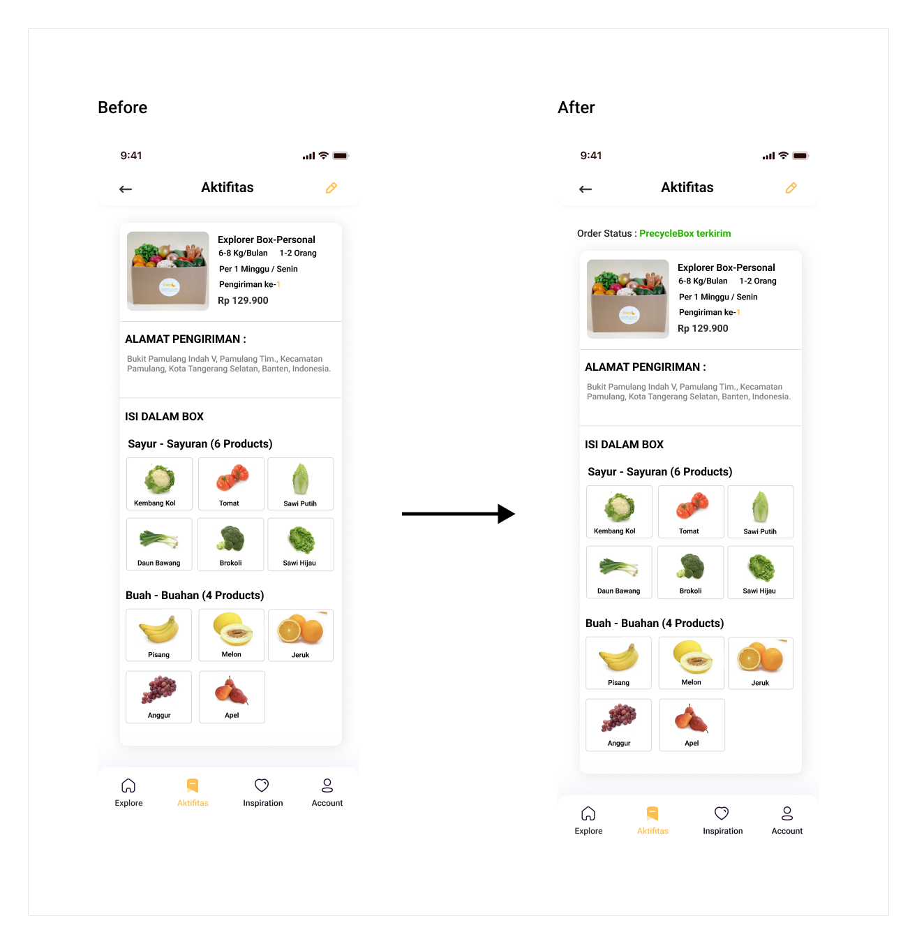 As you can see in the image above, we try to make an improvement by adding a new label “Status Pengiriman:—“.
Farmer Details Information
There is an agreement constraint if we want to display the farmer’s face, name, and location. We need to talk further about it with the farmer. But I promise you I will make it happen 🙂
The Product Image
It was my mistake that I think that the dummy product image that I used in the prototype convinced the user enough about the product and describe how fresh the product is.
This study case gives me another perspective on food waste in Indonesia. Now, I appreciate more the food, the environment, and the farmers. I am also pushing myself when I buy fruit or veggies with imperfect conditions in the grocery market.
On the other hand, for the UX study case. I learned that we as a designer or researchers need to validate our hypothesis to the user because we design for what the user need and not what we like to. I also learned that as a product designer, I have to prioritize the feature based on user needs, engineering constraints, and the impact that the feature will create.